
Do Chart Patterns Still Work? Evidence from 370,000+ pattern detections shows something that contradicts most technical analysis guides: the patterns that look perfect consistently underperform. Here's what actually predicts success.
-
Relaxing Pattern Requirements: We have found that relaxing detection constraints so that less-perfect patterns are found as well. This casts the net wider to find less visible opportunities but also finds a lot of opportunities that are not generating financial potential.
-
Finding Predictive Metrics: Not every less-than-perfect pattern shows the same breakout potential. This is why we created a scoring model with statistically validated results. This model allows us to identify the high potential opportunities and share them with our clients. From the roughly 1,000 detections we are registering every day - less than 50 make it onto our customer-facing list.
This process will only work if you have outcome metrics and have a process that ensures that quality is measured and improved continuously. In this article we will discuss how our detectors are performing and share how we are measuring that performance.
Why perfect patterns underperform
A lot of the performance statistics are being quoted from Thomas Bulkowski, an early chart pattern pioneer, recognized for his discoveries on the topic in the late 80s and early 90s. A lot has changed since then, making it harder to gain an edge leveraging chart pattern analysis:
Crowded Trades
Since the early 90s, stock patterns have gone mainstream - everybody knows about them and markets have been getting much more efficient. If everybody knows about the patterns, the edge on the market is reduced. We've validated this empirically: patterns with 'textbook perfect' characteristics (more touches, cleaner geometry) consistently underperformed messier setups. When a pattern is obvious to everyone, the edge disappears. We discuss this in more detail here.
Market Efficiency
While in the 90s most trades were still conducted in person - computers conduct most of the trades these days. Quantitative analysts have much better tooling available. Much more processing power results in these opportunities being priced into high-volume trades, which are driving market prices.
Should I use Chart Patterns?
This resulted in chart patterns creating less return as quoted by Bulkowski himself: “In 1991, the 10% failure rate stood at 11%. By 2007, the failure rate peaked at 44%.”
It is my opinion that chart patterns can still give you an edge in the market but predicting high-double digit breakouts ahead of everybody else is rare. However, we believe that with the right data, the right analysis, consistent returns of 2% to 3% every two-week cycle is still feasible. While these seem modest, compounded returns at this rate would significantly outpace market averages.
Which Chart Patterns Have the Highest Win Rate?
For every detection we are assessing performance 1 week, 2 weeks, 3 weeks and 4 weeks after the detection, to see how we did. There are 16 patterns we are detecting at this point. The number of patterns shifts from time to time as we retire patterns that drop in performance or cannot be optimized further and as we implement new pattern detectors.
There are three metrics we are tracking:
-
Market Beat Rate, understanding how well our recommendations did in comparison to the market. A rate of 50% states that we are performing as good as the market.
-
Win Rate, understanding what percentage of our recommendations generate a positive return. A rate of 50% basically states that we are rolling a dice.
-
Beta Adjusted MFE, describes the two week increase we see as a percentage compared to the open price of the recommendation date, adjusted for the stock’s variability.
Here are our findings across three key metrics (explained below) for the top scores:
| Pattern Name | Market Beat Rate | Win Rate | Beta Adj. MFE |
|---|---|---|---|
| Bullish Engulfing | 81.9% | 81.7% | 13.2% |
| Volatility Compression | 81.8% | 83.4% | 6.0% |
| Post Collapse Recovery | 79.8% | 77.5% | 5.1% |
| Cup Handle | 74.2% | 75.5% | 12.3% |
| Bull Flag | 72.4% | 74.4% | 14.0% |
| Inverse Head And Shoulders | 71.8% | 75.0% | 13.0% |
| Three White Soldiers | 69.5% | 77.7% | 12.4% |
| Bullish Pennant | 69.0% | 72.0% | 16.7% |
| Breakaway Gap | 66.9% | 74.8% | 7.3% |
| Flat Base | 66.7% | 71.2% | 8.8% |
| Higher Lows Volume Spike | 66.4% | 68.7% | 14.2% |
| Ascending Triangle | 65.1% | 69.5% | 13.6% |
| Symmetrical Triangle | 65.0% | 75.2% | 11.5% |
| Falling Wedge | 62.2% | 70.3% | 14.9% |
| Double Bottom | 59.7% | 65.2% | 6.7% |
| Rounding Bottom | 58.9% | 68.4% | 17.0% |
Top scores are defined as pattern quality scores of 39 or 40 (on a 40 point scale). We consider Bullish Engulfing, Volatility Compression and Post Collapse Recovery our most reliable chart patterns.
The performance metrics shown above degrade with lower pattern quality scores. Using the Three White Soldiers as an example, here is what we see:
| Pattern Quality | Market Beat Rate | Win Rate | Beta Adj. MFE |
|---|---|---|---|
| 40 | 74.3% | 85.7% | 12.7% |
| 39 | 64.7% | 64.7% | 12.1% |
| 38 | 65.2% | 78.3% | 12.7% |
| 37 | 70.3% | 78.4% | 13.2% |
| 36 | 69.1% | 77.2% | 12.5% |
| 35 | 68.1% | 71.4% | 10.6% |
| 34 | 62.8% | 67.9% | 11.5% |
| 33 | 71.1% | 74.7% | 10.8% |
| 32 | 67.3% | 74.9% | 9.6% |
| 31 | 64.4% | 70.0% | 10.7% |
| 30 | 64.7% | 71.5% | 8.9% |
As you can see, generally with degraded pattern quality scores you will see lower performance metrics. Especially towards the top the data gets noisy as detections in those buckets are rare.
We realized our win rate and market beat metrics weren't telling the full story. A 'win' that takes 3 weeks to materialize isn't useful if your stop loss gets hit on day 4.
New Quality Metric: Trade Return
Providing good and intuitive performance metrics for stock trades is not easy. When looking at any stock chart, it matters whether a stock reaches the target price first (win) or the stop loss first (loss). So we are looking for a realistic way to assess how much money our customers would make, if they were to follow our recommendation.
We started simulating this following a very simple trading strategy:
-
Buy on the day of recommendation as soon as the market opens (at market price)
-
The open price needs to be higher than the stop_loss, otherwise avoid the trade
-
The open price needs to be lower than the target, otherwise avoid the trade
-
Set the target the recommended target price
-
Set the stop loss at the recommended stop loss price
-
Exit when either price level is hit or when 10 trading days have passed.
I am sure that active traders are smiling at this simple strategy, but it’s an easy way for us to assess how well each pattern performs. This data is providing us with some interesting insights into how well the predictions can be used to generate returns.
The table below shows four different metrics:
-
2-Week Return: Following the guidance from the trade strategy above, this shows the increase in stock price at exit calculated as a %increase over the open price on the recommendation date.
-
Target Hit %: This shows the % trades that exited because the price exceeded the target value. This is a subset of all wins tracked in the table above.
-
Hit Stop %: This shows the percentage of trades that are exited because the price went below the stop loss.
-
Neither %: A trade was exited after two weeks without hitting either - the stop loss or the target.
Here are the results for the top scores by detector:
| Pattern Name | 2-Week Return | Win % | Neither % | Loss % |
|---|---|---|---|---|
| Cup Handle | 7.3% | 53.6% | 34.2% | 12.2% |
| Higher Lows Volume Spike | 6.8% | 64.2% | 29.6% | 6.2% |
| Bull Flag | 6.0% | 71.2% | 4.3% | 24.6% |
| Falling Wedge | 6.0% | 66.4% | 16.6% | 17.0% |
| Ascending Triangle | 5.5% | 62.5% | 9.1% | 28.4% |
| Flat Base | 4.7% | 64.5% | 18.6% | 17.0% |
| Three White Soldiers | 4.7% | 50.7% | 35.7% | 13.7% |
| Inverse Head And Shoulders | 4.6% | 72.5% | 8.6% | 18.9% |
| Symmetrical Triangle | 4.6% | 69.0% | 6.8% | 24.2% |
| Post Collapse Recovery | 4.1% | 68.4% | 2.6% | 29.0% |
| Breakaway Gap | 3.5% | 43.2% | 21.7% | 35.1% |
| Rounding Bottom | 3.3% | 65.7% | 7.7% | 26.6% |
| Bullish Pennant | 3.2% | 42.8% | 7.8% | 49.4% |
| Double Bottom | 2.3% | 53.3% | 4.5% | 42.2% |
| Bullish Engulfing | 1.9% | 43.6% | 7.0% | 49.4% |
| Volatility Compression | 1.6% | 54.4% | 3.7% | 41.9% |
It is worth noting that some stocks are showing a high market beat rate and show relatively low returns. One example is Volatility Compression. The low return is driven by the high loss rate. This example shows how the right alignment of these three data points will significantly affect the outcome of your trade. We are recommending that our customers consider the stop loss and target values as a starting point, conducting their own analysis before setting the final values.
An accurate prediction no longer just provides you with a correct identification of the stock, but also how much it will move and how much risk will be involved. Successful recommendations will have to (1) identify the correct stock, (2) set a reasonable and realistic target and (3) set a stop loss level that protects the user from excessive losses while providing room for the target to be reached first. If you would like to understand the difficulty - feel free to watch these videos and assess your ability to predict the right outcome.
Example
This chart shows about ten weeks of stock trend for NPKI (NPK International Inc.):
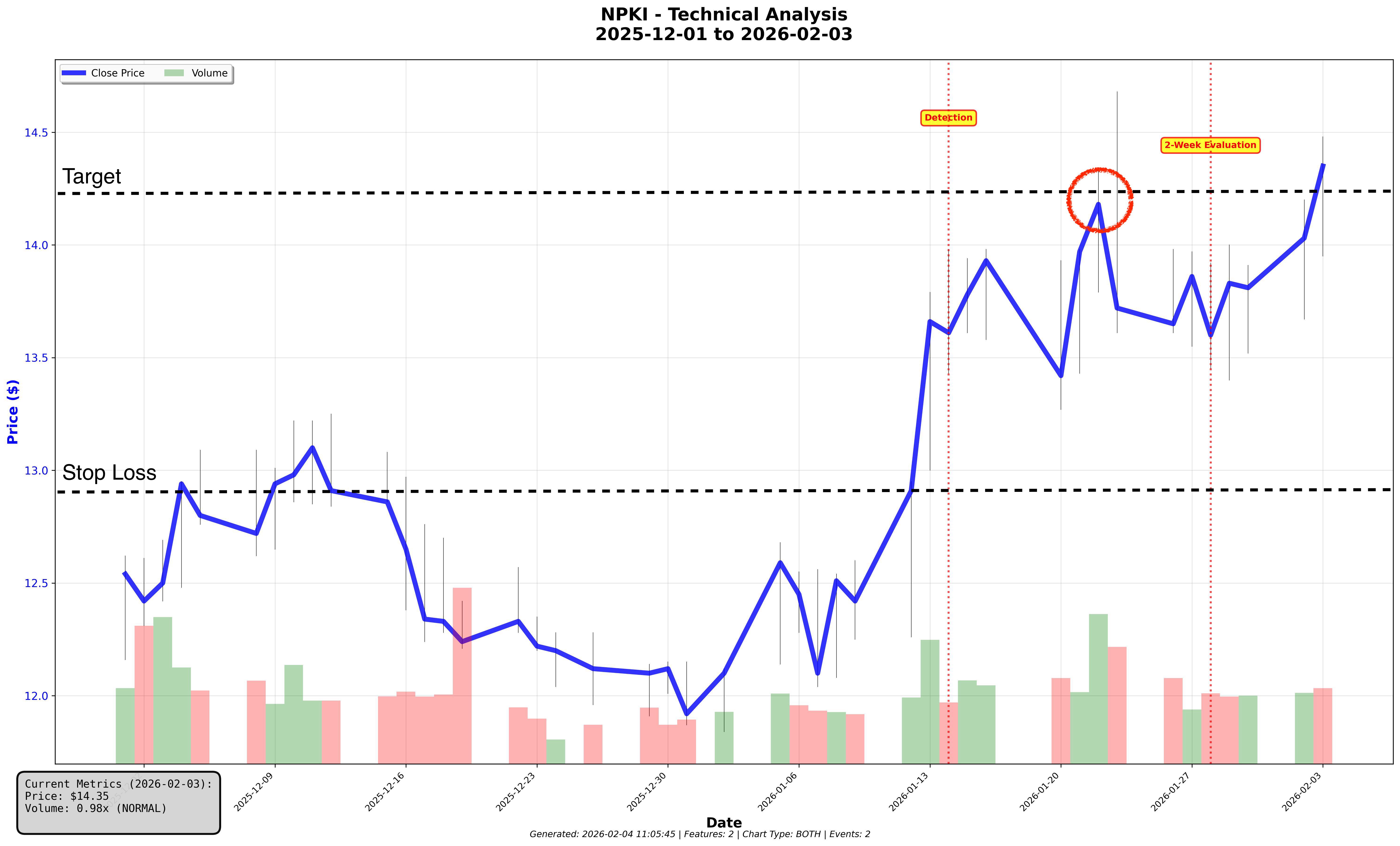
NPKI was detected as a symmetrical triangle (31 pattern quality score) and opened on 14 Jan at $13.67, with the stop loss set at $12.90 and a target set at $14.49. The first time the high price for the day went beyond the target was 23 Jan with a high of $14.68, while the low never touched the stop loss. During the same timeframe the NYSE generated a return of 0.32%. The highest close price for the stock was on 22 Jan at $14.18.
-
Result: Win - because the stock price never touched the stop loss crossed the target line on 23 Jan.
-
Return: $0.82 per share (open price on 14 Jan compared to target price of $14.49)
-
Return %: 6.0% (Return / Open Price on 14 Jan)
-
Market Beat: Yes - because the return for this stock was 2.5% compared with a 0.3% return for the NYSE during the same period.
-
Mean Favorable Excursion (MFE): 3.7% (delta as a percentage of 22 Jan close and 14 Jan open)
-
Beta Adjusted MFE: 2.9% (MFE adjusted for stock volatility relative to SPY)
If you would like to get daily recommendations like this, you can sign up here.
Our Pattern Detection Accuracy Metrics explained
Why Holding Longer Rarely Helps: The Two-Week Window?
Over the months we have run extensive analysis and have found that information to be gained from chart patterns only has value for about two weeks. That means that if we have provided you with a stock recommendation and the stock has not reached the target then it is unlikely to do so soon.
We did an extensive analysis of breakouts of more than 10% on NYSE here and found that:
-
The average breakout lasts only about 7 days.
-
About 1% of breakouts last more than two weeks.
We also track every detection at 1, 2, 3, and 4 weeks. The two-week and four-week results are nearly identical, confirming that chart pattern signals lose predictive power after the initial move. If a stock hasn't moved in two weeks, the pattern information we share is exhausted. Holding it longer means you're just taking uncompensated market exposure.
How do we evaluate Chart Pattern Performance?
When we first learned about chart patterns, we came across metrics such as 10% failure rate. We felt that those types of performance metrics don’t provide enough context around how profitable a recommendation will be. Hence, we decided with our metrics to answer those questions:
-
What is the risk I will take with investing in a recommendation?
-
How well did this recommendation perform relative to the market?
-
What is the maximum favorable gain of this recommendation?
Let me address each of those questions in detail:
What is the risk I will take investing in a Recommendation?
We believe that once taking on risk it is critical to understand the magnitude of the risk. We can quantify this as a percentage calculated over thousands of detections. This gives you an idea of how likely it is that this stock will break out in the next two weeks. When we provide you with a win probability of 80%, we are stating two things:
-
If I bet on ten recommendations with a win probability of 80% that will mean that eight out of ten recommendations will generate positive return.
-
You will also know that two of those recommendations will lose you money - so you want to be aware of that and manage that aspect. While 80% win probability is pretty good - it’s still no guarantee for a win.
-
We are also considering a win only every gain over 0.5% gain - to provide some buffer.
We call this metric Win Probability and define the likelihood that a stock price will close in two weeks at least 0.5% higher than it is now. I would encourage you to track this data in your trade log to reflect on your appropriate risk level.
How well did this recommendation perform relative to the market?
This question is not asked often enough. Too many times we hear that a model observed 15% returns or more. The number by itself sounds impressive but is not enough to assess performance. What, if I told you that the market at the same time was growing by 20%? It will make this result look much less impressive. The opposite is true too: if the market contracted 10% at the same time, this return looks much more impressive.
This is why we measure Market Beat Rate - no matter what the market regime is - we want to outsmart the market. We measure market beat rate as the relative return between the time the stock gets purchased and the stock gets sold. If the stock return is higher than that of the market, we beat the market, otherwise we don’t.
What is the maximum favorable gain of this recommendation?
With this question we want to understand how far the stock did move and in which direction it moved. It will give us a good understanding of how right we were with our recommendation and how much upside is possible. This metric on a single transaction does not provide a lot of insights but over a large amount of detections educates us on the general magnitude of such breakouts. Hence we are measuring Beta adjusted Mean Favorable Excursion (MFE). The metric shows us what the maximum gain (based on close prices - not high prices) from the open value on the day of the recommendation. This number is still adjusted based on the variability of the stock. If the stock is more volatile than the market then the value is scaled down, otherwise it is scaled up.
It is worth noting that we are measuring the mean excursion. That means that stocks might close lower than the MFE. If a stock gains 10% in the first few days but has lost 20% of it’s value the MFE would still show a 10% gain - even though the stock closed lower than at the start of the period.
Due to those shortcomings of the MFE methodology we are looking at the trade returns metric mentioned above more closely and it is gradually becoming another standard performance metric for us.
What does this mean for you?
The data we are sharing here has implications for how you should consume this data:
-
The data we are publishing has real value: As you can see, the recommendations we are sharing have real financial value. The top ends of each pattern are profitable and can generate positive returns in the long run.
-
Successful trades depend on the right combination of entry, stop loss and target: As we have shown, good detections can help you improve your edge over the market but where you set the stop loss and the target is just as important for a successful trade. We encourage you to track those values in your trade log.
-
If you are manually scanning charts: Narrow your focus to just a few patterns (less than four) and understand the right setup of stop loss and target. This will allow you to sharpen your mind in detecting sub-optimal patterns for your trades.
Textbook perfect patterns never provide real opportunities - it’s the imperfect - more difficult-to-spot patterns - that provide real value. Understanding which imperfections are tolerable and then finding those imperfect patterns is almost impossible to do manually. This is where we can help: point you to the right opportunities and provide you a starting guidance on where to set key variables. You can sign up here. We will provide the opportunities allowing you to focus on researching a narrow list of stocks and finalizing your trade decision by applying your unique strategy.
Disclaimer: StockDataAnalytics.com is a financial data and analytics service. The information provided through our platform, including stock pattern detection, entry zones, stop losses, and price targets, is for informational and educational purposes only and does not constitute financial advice, investment advice, trading advice, or any other type of advice. We are not registered investment advisors, broker-dealers, or financial planners. Past performance of any pattern or recommendation does not guarantee future results. All investments involve risk, including the possible loss of principal. You should consult with a qualified financial advisor before making any investment decisions. By using our service, you acknowledge that all trading decisions are made at your own risk.