
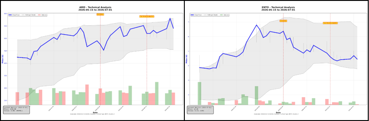
Two detections, same detector, same morning, opposite outcomes. What separates them, and how we are building a system that can tell in advance.
On 9 June 2026 our bull flag detector flagged two names before the open. ENTO and AMD, both textbook versions of the same pattern, both surfaced by the same code on the same morning.
AMD hit its conservative target on day two for a simulated 4.96%. ENTO stopped out the next day at 2.6% down, and by the end of the two-week window it had fallen another 20.7%, compared to a 2.5% gain in the market during the same period.
Same pattern. Same detector. Same day. If you have traded chart patterns yourself, you have lived this, and it is the single most common reason people conclude that technical analysis is nonsense.
I do not think that is the right conclusion. The right conclusion is narrower and more useful: the pattern tells you what shape you are looking at. It does not tell you how likely that shape is to work. Those are two different questions, and almost everybody who publishes chart patterns only answers the first one.
What we do about it: score every detection
At StockDataAnalytics, we scan roughly 6,000 stocks each trading day across NASDAQ and NYSE, and sixteen detectors run over them looking for their own pattern. On a typical day that produces around four hundred qualifying setups. Twenty go out to subscribers.
The step in between is the product. Every detection gets a score from 0 to 40, built from three dimensions that each read a different kind of evidence. Structure asks whether the shape itself is drawn the way winning setups are drawn: trendline fit, symmetry, the depth and length of the pattern. Volume asks whether trading activity backs the shape up, because a pattern forming on quiet accumulation behaves differently from the same pattern forming on noise. Breakout Readiness asks how close the setup is to actually moving: where price sits against resistance, how tightly the recent range has coiled. All sixteen detectors put their scores into one pool and compete for the same twenty slots, so a bull flag at 36 displaces a rounding bottom at 35.
In our AMD/ENTO example above the AMD pattern scored a 37, the ENTO pattern scored a 32. Two names prove nothing on their own, which is why the next section measures this across 450,000 detections.
Our objective is to build models where a higher score means a detection is more likely to experience a long breakout, is expected to earn a higher two-week return, and is more likely to beat the market over the same window.
We measure product performance as win rate: the percentage of predictions that generate a positive return over the subsequent two weeks under a simple trading strategy.
Does the score actually rank?
On some detectors, yes, and we can now say that with a much harder test behind it. Every model is trained on data through the end of 2025, including the sealed slice we use for the final verdict. The first seven months of 2026, roughly 450,000 evaluated detections, have never been touched by any training process. What follows is measured entirely on that untouched data.
Here is symmetrical triangle on that confirmation data, grouped into separate score bands so each row is its own population:
| Score band | Win rate | Avg trade return | Stopped out first | Detections |
|---|---|---|---|---|
| 20 to 30 | 54.5% | +0.22% | 40.3% | 15,902 |
| 30 to 32 | 57.9% | +0.54% | 36.2% | 1,620 |
| 32 to 34 | 53.6% | +0.54% | 31.9% | 859 |
| 34 to 36 | 56.1% | +0.44% | 30.6% | 387 |
| 36 to 38 | 61.5% | +1.12% | 25.5% | 104 |
| 38 and above | 60.0% | +1.26% | 19.0% | 25 |
The interesting piece is the third column. The share of trades that hit their stop before their target falls at every single step, from 40.3% at the bottom of the range to 19.0% at the top. A trade closes at its target or at its stop, whichever comes first, so what the score is finding here is setups where the move arrives before the stop gets hit. That is what we want the score to be: higher means more likely to succeed, and more stable on the way there (fewer false stops).
Flat base does the same thing: stop-outs fall from 44.3% to 35.1% through the 36 to 38 band while average trade return climbs from 0.23% to 0.87%. So does bullish engulfing, from 48.1% down to 33.0% with return quadrupling to 1.06%, and the second, independently fitted version of that detector reproduces the curve almost exactly. Two models built separately, agreeing on data neither has seen, is the kind of evidence one pretty backtest cannot give you.
That is what our aspiration looks like when a detector reaches it. I want to be equally clear that plenty of detectors are not performing at that level. Several detectors show flat curves on this confirmation data, where the score barely separates good setups from bad ones, and a few currently rank in the wrong direction. Those models are back in the queue, and the 2026 confirmation set is now the bar every re-fit has to clear before we call it progress.
Closing that gap is exactly what the rest of this article is about. The automated pipeline in the next section is what lets us re-fit and re-test sixteen detectors at a pace one person never could, and the checks it runs are what keep that speed from manufacturing models that are performing poorly outside their training period. That extensive model search is generating measurably better quality models. From those models we - in turn - are learning what type of features tend to have higher predictive values, resulting in the development of higher quality features.
How we build the models, and why speed made it worse
Building one scoring model by hand took me the better part of a week, most of it building and analyzing correlation tables and finding effects that are consistent across multiple time periods. Sixteen detectors, five to nine versions each, and the arithmetic gets unpleasant fast. So I automated it.
Automating the work took months of engineering, and it is starting to show real results. It also raises the risk of overfitting: a model learns trends that exist only in its training data, so it looks accurate on the past and fails on anything new.
The pipeline runs in three phases. Phase 1 screens several hundred candidate features per detector down to roughly twenty survivors, testing each one only on the training data. Phase 2 fits a model over those survivors and projects it onto a readable point scale, so the finished scoring rule is something we can inspect line by line. Phase 3 validates once, against the most recent quarter of data that nothing upstream has been allowed to touch, using a decision rule written down before the data is opened.
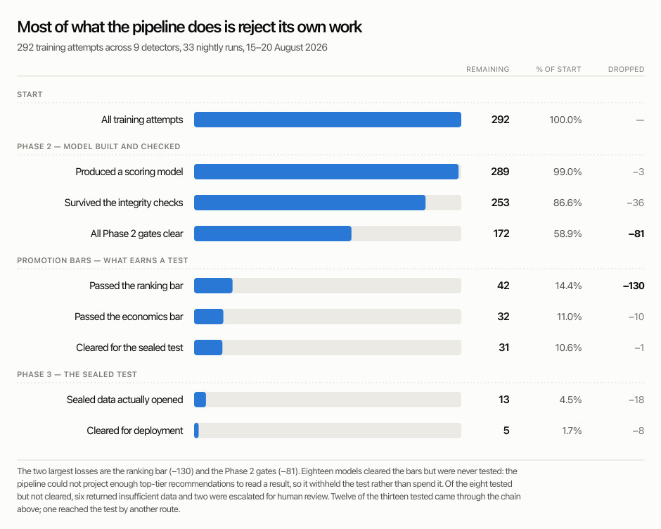
Most of what that pipeline does is reject its own work. Over six days in August we built 292 candidate scoring models across 33 runs and nine detectors. The gates rejected 261 of them. Eighteen more cleared every quality bar and were still withheld from the sealed test. Thirteen were tested; five cleared for deployment. See the details below:
The checks that make a passing result mean something
The funnel above is the pipeline's own scorecard for six days in August 2026. Each line is a filter, and each exists because something specific broke once. Below, each line is explained along with what actually accounted for the models it removed. Every figure quoted is a breakdown of a drop shown in the chart.
All training attempts (292). Across 33 runs and nine detectors, the pipeline built 292 candidate scoring models. Each is a complete attempt: a feature screen, a fitted model, a translation into a readable point ladder, and a verdict. That volume is both the point and the problem. A person evaluating twenty ideas over four days has twenty chances to be fooled by coincidence; a machine evaluating 292 in six days has 292, and it will not notice the difference unaided. Everything below this line exists to make throughput safe rather than merely fast.
Produced a scoring model (289). Three attempts never reached a model. Phase 1 requires a minimum number of features to survive screening before Phase 2 is permitted to fit anything. If the feature count is below that floor there is nothing to build with, and the pipeline records no model rather than fitting a scoring rule on weak inputs. This is the least interesting line in the chart, and that is the intended state. Infrastructure should rarely be the reason work stops, and in this window it rarely was.
Survived the integrity checks (253). Thirty-six models were removed for reasons unrelated to performance and entirely related to trustworthiness. Seventeen failed score-boundary stability: the threshold defining the high-confidence tier must survive resampling. A cut-off resting on a noise spike creates a tier that exists in the backtest and nowhere else. Thirteen failed validation amplification, which rejects any model performing more than 30% better on data it was not fitted to. This is counterintuitive as a failure, but a model that improves on unseen data is almost always keyed to something particular about that period. Five reversed the direction of their own relationship between periods, and one failed on two counts at once.
All Phase 2 gates clear (172). Eighty-one models were lost here, and 76 of them to a single failure: model collapse. A collapsed model is one that has flattened out and stopped discriminating based on the features discovered. It still produces a score, but the score no longer separates high quality candidates from low quality ones. It is the most common failure mode in the entire pipeline and the easiest to miss, because a collapsed model does not look broken; it looks unremarkable. Three more failed reconciliation, the check that the shipped scoring code reproduces the fitted model's numbers. Among all 81, twenty-one carried at least one return inversion, where a higher scoring band performed worse than the band beneath it, and sixteen were already flagged as underpowered by construction.
Passed the ranking bar (42). This is the largest filter we operate, removing 130 of the 172 models that reached it. To clear it, a model must show that its score order predicts outcome order on data it has never seen. Further, the lower bound of a confidence interval must sit above zero, not the point estimate. Eighty-eight of the 130 could not clear zero on that measure at all; the remainder cleared it and failed elsewhere in the bar, most often on the correction that discounts a result by how many attempts were made to find it. The more revealing number is that 87 of the 130 were flagged as underpowered by construction, meaning the effect we were hunting was smaller than the sample could reliably detect. Most of what dies here was never measurable in the first place.
Passed the economics bar (32). Ten models cleared the ranking bar and failed here, and the reason is not the obvious one. Every one of the ten had a profitable top tier, with return lower bounds running from +0.08 to +3.27. They failed because the ladder did not hold together: all ten carried at least one return inversion, ranging from a single reversal to thirteen, and none was monotonic across its bands. This distinction matters commercially more than raw profitability. Every detector competes for the same limited daily slots, so a scoring model whose bands are out of order does not merely underperform. It actively promotes its own weaker candidates ahead of better-rated names from elsewhere. A profitable top tier sitting above a disordered ladder is not a model we can put into a competitive pool.
Cleared for the sealed (holdout) test (31). One model was lost at spec conversion, the final confirmation that the scoring rule we would deploy is identical to the one that was validated. This reads as plumbing and is in fact the check that catches the most dangerous class of defect: a model that validates beautifully in the laboratory and scores differently in production. Earlier this year a defect in this same step silently blocked every candidate we produced for ten consecutive days, which is the reason it is now measured on every attempt rather than assumed.
Sealed data actually opened (13). Eighteen models cleared every quality bar above and were still not tested, and this is not a quality filter at all: Before spending a one-time test we project how many recommendations will land in the high-confidence tier; below roughly 300 observations we cannot distinguish a real edge from luck, so we withhold the test rather than waste it on a result nobody could read. Nine were blocked with a recorded reason: six underpowered, two whose operating tier contained nothing at all, one with an unstable boundary. The remaining nine were not reached within the window. Those models are parked, not rejected, and we record that distinction deliberately.
Cleared for deployment (5). Of the thirteen models tested, five came back deploy-class, six returned insufficient data, and two were escalated for human review. Insufficient data is the honest majority verdict: the test ran and could not tell, which is a different and considerably more useful answer than a confident wrong one. The five that cleared go to parallel deployment, running alongside the incumbent model and judged on forward results rather than on the backtest that earned them the slot.
Five of 292 is what six days of this pipeline produces. The clearest illustration of why that last line is so narrow came earlier this year, when a bull flag candidate cleared every gate above and reached the sealed test with our automated advisory calling it deploy-class. On sealed data its win rate in the high-confidence tier came in at 50.9% against 65.4% for the model already in production. This is a gap of 14.5 points, with a confidence interval running from -21.2 to -7.7. A person read those numbers line by line and overruled the advisory. The verdict recorded in our files reads DO NOT DEPLOY. That judgement is the part I would not automate.
Where we are, honestly
Our target is a 75% market beat rate for our top scores: three in four should do better than the index over the two-week window. We are not there. Across the first seven months of 2026, detections scoring 38 and above beat their benchmark 44.2% of the time (3,110 detections, on the same untouched data as everything above).
We also have a reasonable idea why. The average correlation between any two features our models use runs between 0.80 and 0.88, which means our feature set is close to one idea expressed in many different ways, and no model can extract more information than its inputs contain. That is why two things are in flight: re-fitting the detectors whose scores do not yet rank, and widening the feature set with genuinely new inputs. The pipeline above is what makes that a matter of months rather than years, and the 2026 confirmation set decides whether an improvement counts.
I publish this because this is what building the product looks like from the inside. The numbers are not where we want them, we know exactly where they fall short, and the machine to close that gap is already running. As new models clear it, these tables get updated. Come back and check them against this article.
Frequently asked questions
Short answers to the questions this article gets asked, with the evidence above.
Do chart patterns actually predict stock movements?
The pattern shape alone predicts less than most traders assume. A pattern tells you what shape you are looking at, not how likely it is to work: on 9 June 2026 our detector flagged two textbook bull flags, and one gained 5% while the other fell 21%. What separates them is measurable setup quality, which is what a scoring model estimates.
How does StockDataAnalytics score stock patterns?
Every detection receives a score from 0 to 40 across three dimensions: Structure (is the shape drawn the way winning setups are drawn), Volume (does trading activity back the shape up), and Breakout Readiness (how close the setup is to moving). All sixteen detectors compete for the same twenty daily recommendation slots.
Do higher pattern scores mean better trades?
On our best detectors, yes, and the clearest effect is stability rather than direction. On symmetrical triangles, trades that hit their stop before their target fell from 40.3% in the lowest score band to 19.0% in the highest, across seven months of 2026 data no model was trained on. Several other detectors do not yet show this, and those models are being re-fitted.
What is overfitting in a stock prediction model?
Overfitting is when a model learns quirks that exist only in its training data, so it looks accurate on the past and fails on new data. It is the central risk of automated model training: our pipeline built 292 candidate models in six days and rejected or withheld 279 of them, largely through checks designed to catch exactly this.
How do you test a stock scoring model honestly?
Validate it only on data no part of the training process has touched. We train on data through 2025, including the sealed slice used for the final verdict, and confirm on 2026 forward data, roughly 450,000 evaluated detections. A model must also clear stability, ranking, and economics gates before that one-time sealed test is spent.
How accurate are StockDataAnalytics recommendations?
Our target is a 75% market beat rate for our top scores and we are not there: across the first seven months of 2026, detections scoring 38 and above beat their benchmark 44.2% of the time, across 3,110 detections. We publish that number because you should not trust a service that only shows you its wins.
What is market beat rate?
Market beat rate is the share of recommendations that outperform a benchmark index over the same holding period. A stock can rise and still trail the market, so beat rate is a stricter test than win rate: it asks whether a recommendation did better than simply holding the index. We measure it over a two-week window against the index relevant to each stock.