
Most chart pattern guides give you a list of 20-45 formations and call it education. That's not helpful, it's overwhelming. When you're starting out, you don't need a comprehensive guide. You need some focused guidance.
After scanning 6,000+ stocks daily and tracking which stock patterns actually appear in tradeable form, we've identified seven patterns worth learning first. These aren't chosen arbitrarily. They're ranked by three criteria: how frequently they appear, how easily beginners can identify them, and how reliably they perform in real markets.
These seven patterns account for 75% of the actionable setups we detect daily. Master these before worrying about the rest.
Why Most Pattern Guides Fail Beginners
Traditional technical analysis education makes a critical error: treating all patterns as equally important. They're not.
Some textbook patterns like triple tops or complex harmonic patterns rarely appear in clean, tradeable form. You can spend months learning to identify them, only to encounter a genuine, actionable example a few times per year. That's a poor return on your learning investment.
Meanwhile, simpler patterns like bull flags and ascending triangles appear daily across the market. They're less exotic, less impressive to discuss at trading meetups and far more practical.
There's another problem: textbooks show perfect examples. Real charts are messy. Our data shows that "textbook perfect" patterns often underperform slightly imperfect ones (likely because perfect patterns attract crowded trades). Beginners need to see what real patterns look like, not idealized illustrations.
How We Ranked These Patterns
Every pattern we detect receives scores across three dimensions. For this beginner guide, we weighted those dimensions by what matters most for someone just learning:
Frequency (40% weight) How often does this pattern appear in tradeable form across the market? Patterns that appear daily provide more learning opportunities than patterns appearing monthly.
Identifiability (35% weight)
Can a beginner reliably spot this pattern without extensive training? Some patterns require nuanced judgment that takes years to develop. We prioritized patterns with clear, unambiguous characteristics.
Reliability (25% weight) What's the actual success rate? We weighted this lower because even reliable patterns fail sometimes, and beginners need practice with all outcomes—not just winners.
The seven patterns have a combined market beat rate of 67.6%, meaning that roughly two out of three recommendations generate returns higher than what the market overall returns. These numbers come from evaluating stock patterns across 6,000+ stocks over 150 trading days.
The 7 Best Chart Patterns for Beginners
1. Bull Flag Pattern
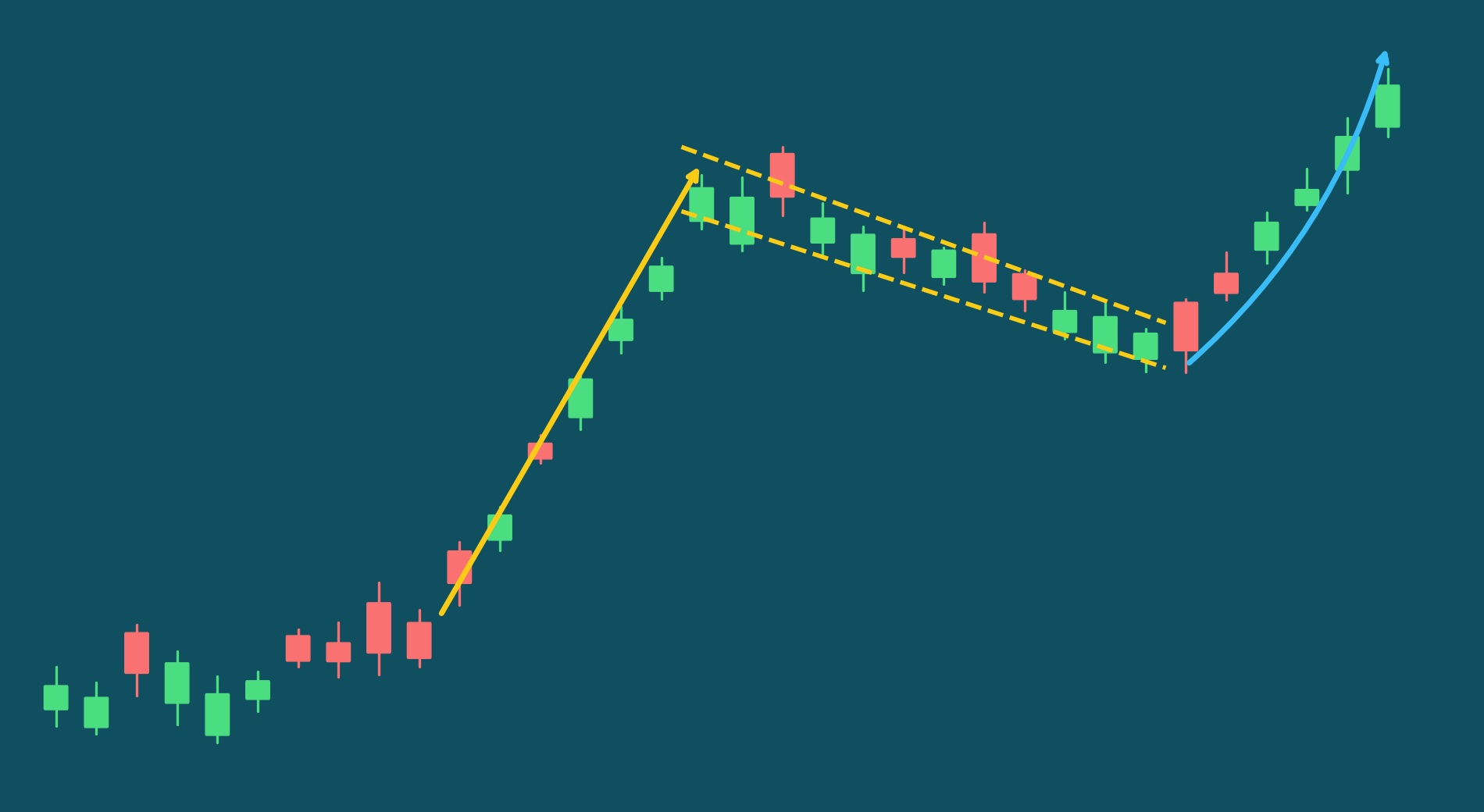
Category: Continuation
What it looks like: A sharp upward move (the "flagpole") followed by a slight downward or sideways drift forming a small channel or rectangle (the "flag"). The pole represents a burst of buying energy and the flag is the pause that follows, usually lasting anywhere from a few days to several weeks. Volume typically declines during the flag as the selling pressure fades, then picks back up when price resumes upward.
What it signals: The uptrend is taking a breather, not reversing. Early buyers are consolidating gains while new buyers wait for the next entry point. The declining volume during the flag tells you that nobody is aggressively selling and holders are content to wait. When buying interest returns and the flag breaks upward, the trend resumes, often with a move comparable in magnitude to the original pole.
From our data: Bull flags represent 21% of our daily continuation pattern detections. We see a 72% market beat rate over a two-week holding period. When successful, the average breakout move is 6.4%.
Common mistakes:
- Entering during flag formation rather than waiting for breakout confirmation. The flag is the pause, not the signal. Jumping in mid-consolidation means you might sit through more downward drift before any breakout materializes or watch the pattern fail entirely.
- Not checking volume behavior. Valid flags show declining volume during consolidation. If volume stays elevated or spikes during the flag, sellers may be more active than the pattern suggests, and the consolidation could turn into a genuine reversal.
- Confusing a steep single-day spike with a quality flagpole. The most reliable flagpoles are strong but not extreme. A steady multi-day climb tends to outperform a single vertical spike. Near-vertical moves often attract profit-taking that overwhelms the subsequent consolidation.
- Accepting flags that drag on too long. A flag that consolidates for more than a few weeks starts to lose its identity. At some point, the "pause" becomes a new trading range and the flagpole's momentum has dissipated. Very short flags (one or two days) are also suspect: the consolidation hasn't had time to prove that sellers are truly exhausted.
Quick tip: Pay attention to how much of the flagpole's gains the flag gives back. The best setups retrace only a modest portion of the pole. Buyers are stepping back in before the stock can fall much. If the flag retraces most of the pole's gains, the pattern is telling you that the original buying impulse wasn't as strong as it looked. Also watch the flag's range relative to the stock's normal volatility: a tight, narrow flag on a typically volatile stock signals genuine compression, while a tight flag on a stock that barely moves anyway isn't telling you much.
2. Three White Soldiers Pattern
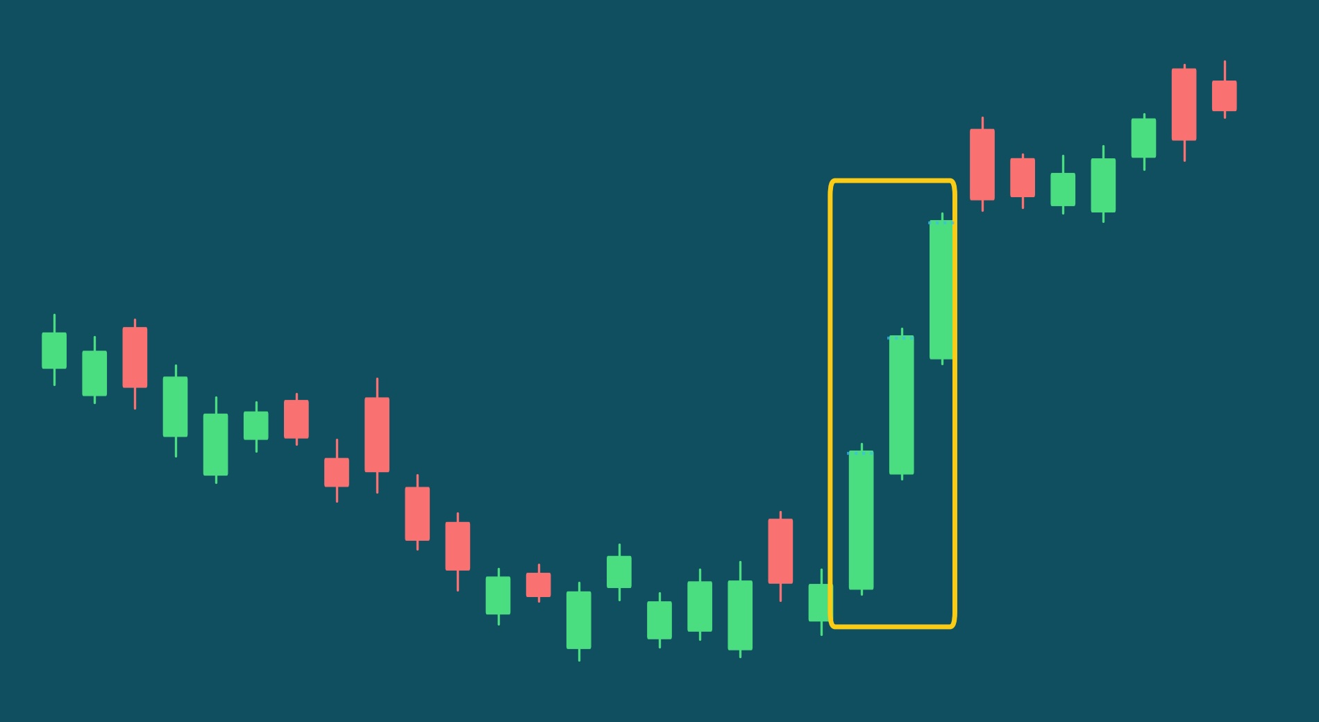
Category: Candlestick
What it looks like: Three consecutive green (bullish) candles, each closing higher than the previous day. Each candle should open within or near the prior candle's body and close near its high, showing consistent, sustained buying pressure over three full sessions. The candles should have relatively small upper wicks, meaning buyers maintained control through the close rather than letting sellers push the price back down before the end of the day. The three candles should be roughly similar in size, showing steady pressure rather than one dominant candle carrying the other two.
What it signals: Strong, committed buying over multiple days. Unlike a single big green candle (which could be a one-day event driven by news or a short squeeze), three consecutive strong up-days suggests institutional buyers are actively accumulating and willing to chase the price higher. Each successive day's buying confirms the prior day's conviction. This pattern is particularly powerful as a reversal signal: three white soldiers emerging from a downtrend or consolidation zone indicate that the balance of power has shifted decisively from sellers to buyers.
From our data: This pattern gets detected about five times every two days. The pattern beats market trends about 70% of the time. Positive breakouts generate an average return of 5.5% over two weeks. Because the pattern only requires three days of price data to form, it tends to be one of our more frequent detections, but the quality filters around candle structure, context, and momentum keep the actionable signal count manageable.
Common mistakes:
- Not checking context. Three white soldiers after a 30% run is likely exhaustion, not continuation. The pattern is most reliable when it represents the start of renewed buying, emerging from a pullback, consolidation zone, or downtrend. Three strong up days after an already extended move often mark the final push before a reversal.
- Accepting candles with large upper wicks. True soldiers close near their highs with minimal wicks. A candle that rallied strongly during the day but gave back a significant portion by the close shows that sellers stepped in: that's not the kind of conviction this pattern is supposed to demonstrate. Each candle should show buyers in control from open to close.
- Ignoring relative candle size. The three candles should be similar in size, showing consistent pressure. If the first candle is massive and the next two are tiny, the buying momentum is actually fading, not sustaining. Similarly, if the third candle is dramatically larger than the first two, it may signal a climactic buying spike rather than steady accumulation.
- Overlooking volume confirmation. While the three-candle structure is the primary signal, volume behavior provides important context. Ideally, volume should be steady or increasing across the three days. Declining volume across the three soldiers suggests that participation is waning even as price climbs, fewer buyers are chasing each successive high.
Quick tip: The most reliable three white soldiers patterns emerge from a consolidation or pullback, not from an already extended move. Look for the pattern to appear after a stock has pulled back to a support level or spent time building a base. That context tells you the three days of buying represent fresh demand, not the last gasp of an exhausted rally. Also pay attention to the overall energy of the move: three modest, controlled up days tend to signal more sustainable trends than three explosive gap-up days, which can burn through buying interest too quickly.
3. Symmetrical Triangle Pattern
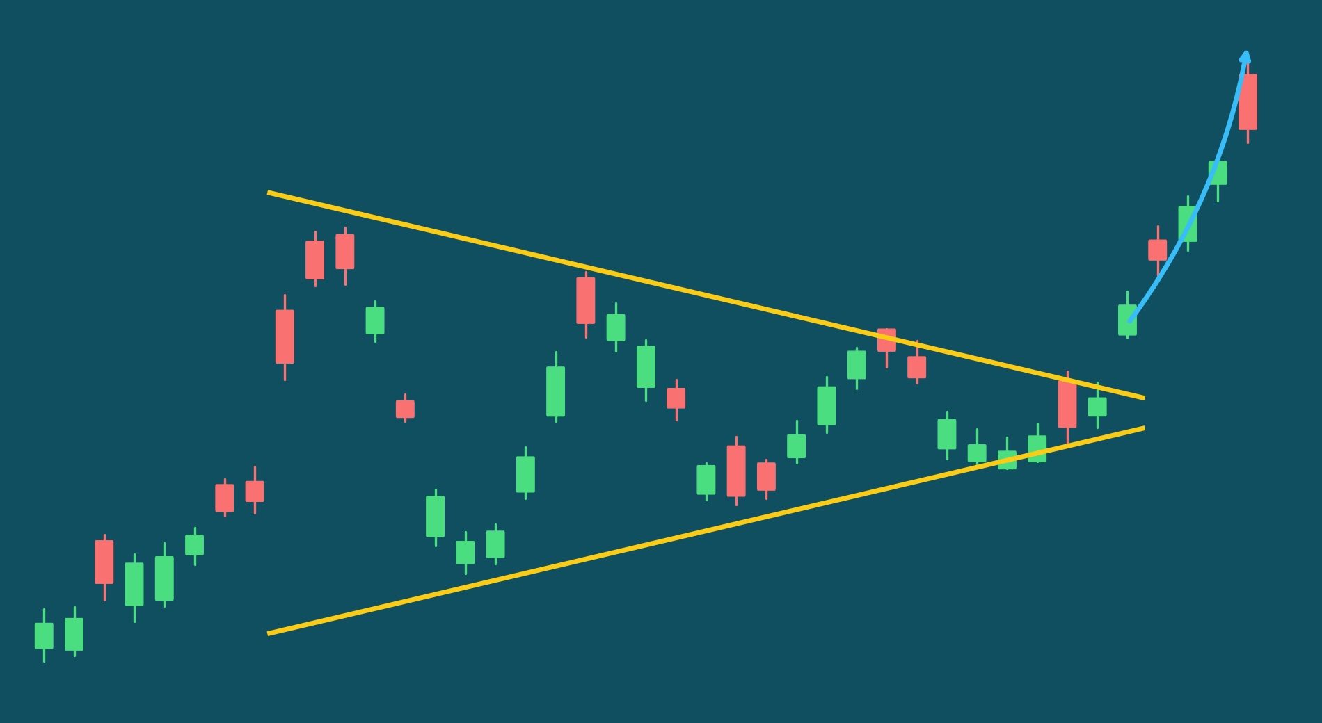
Category: Continuation
What it looks like: Price makes lower highs AND higher lows, converging into a point where both trendlines meet. Unlike ascending triangles (flat top) or descending triangles (flat bottom), both trendlines slope toward each other. The pattern typically forms over 2-12 weeks with at least two touch points on each trendline, and the range narrows progressively as buyers and sellers compress into a tighter and tighter band. Volume usually declines during formation.
What it signals: Indecision that's building toward resolution. Neither buyers nor sellers are gaining ground, but the narrowing range means the standoff can't last forever. Each successive swing has less energy than the last, like a pendulum winding down. The eventual breakout is often explosive because the compression represents stored energy, and the longer and wider the triangle, the more energy is stored. While symmetrical triangles can theoretically break in either direction, we focus our analysis on setups showing early signs of upward resolution: positive breakout candles, upward velocity, and price positioned near resistance rather than support.
From our data: About 5% of our continuation patterns are symmetrical triangles. Good setups beat the market about 68% of the time. Successful breakouts generate an average return of 6.0%.
Common mistakes:
- Trying to guess the breakout direction before it happens. Symmetrical triangles are genuinely bilateral. Unlike ascending triangles, there's no built-in directional bias from the pattern shape alone. Wait for the breakout to declare itself rather than betting on a direction based on gut feeling.
- Entering during compression rather than waiting for a decisive close outside the triangle. The compression phase can be frustratingly long. Stocks can bounce between the converging trendlines many times before finally breaking out. Premature entries during this phase mean you're exposed to whipsaws in both directions.
- Ignoring the breakout candle quality. The character of the breakout candle is one of the strongest confirmation signals. A candle that closes strongly above its open, well outside the triangle, with the stock finishing near the day's high - that's real conviction. A candle that pokes outside the triangle but closes back near where it opened is weak and unreliable.
- Not considering the prior trend. While the triangle itself is neutral, context matters. Symmetrical triangles that form during an uptrend (higher prices leading into the pattern) more often break upward. The prior trend tells you where the path of least resistance likely lies.
Quick tip: Pay attention to the triangle's "energy": wider triangles that form quickly tend to have more explosive breakouts than narrow triangles that form slowly. The amount of price range compressed into a given time period matters more than the shape's geometric perfection. Also, breakouts that occur in the final third of the triangle (closer to where the trendlines would converge) tend to be more decisive than early breakouts. If a triangle is barely a third formed, the setup may need more time to develop before a meaningful resolution occurs.
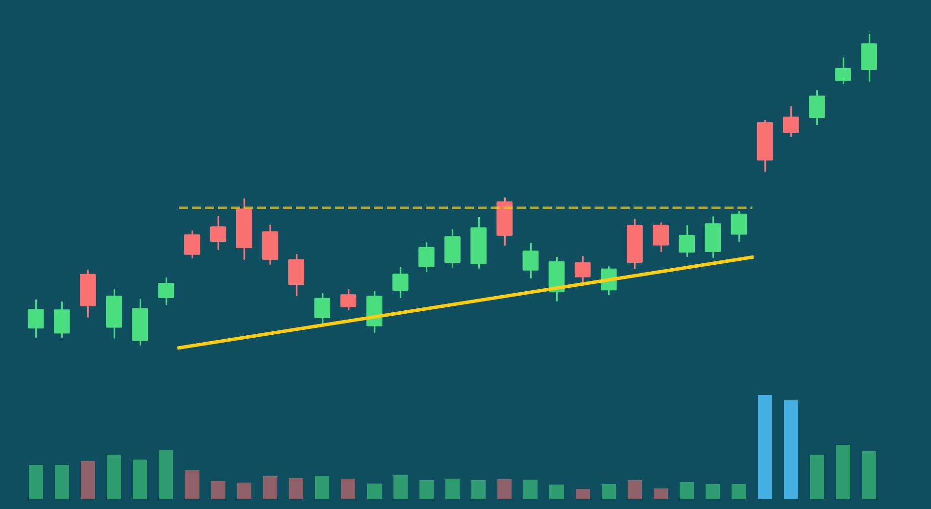
4. Ascending Triangle Pattern
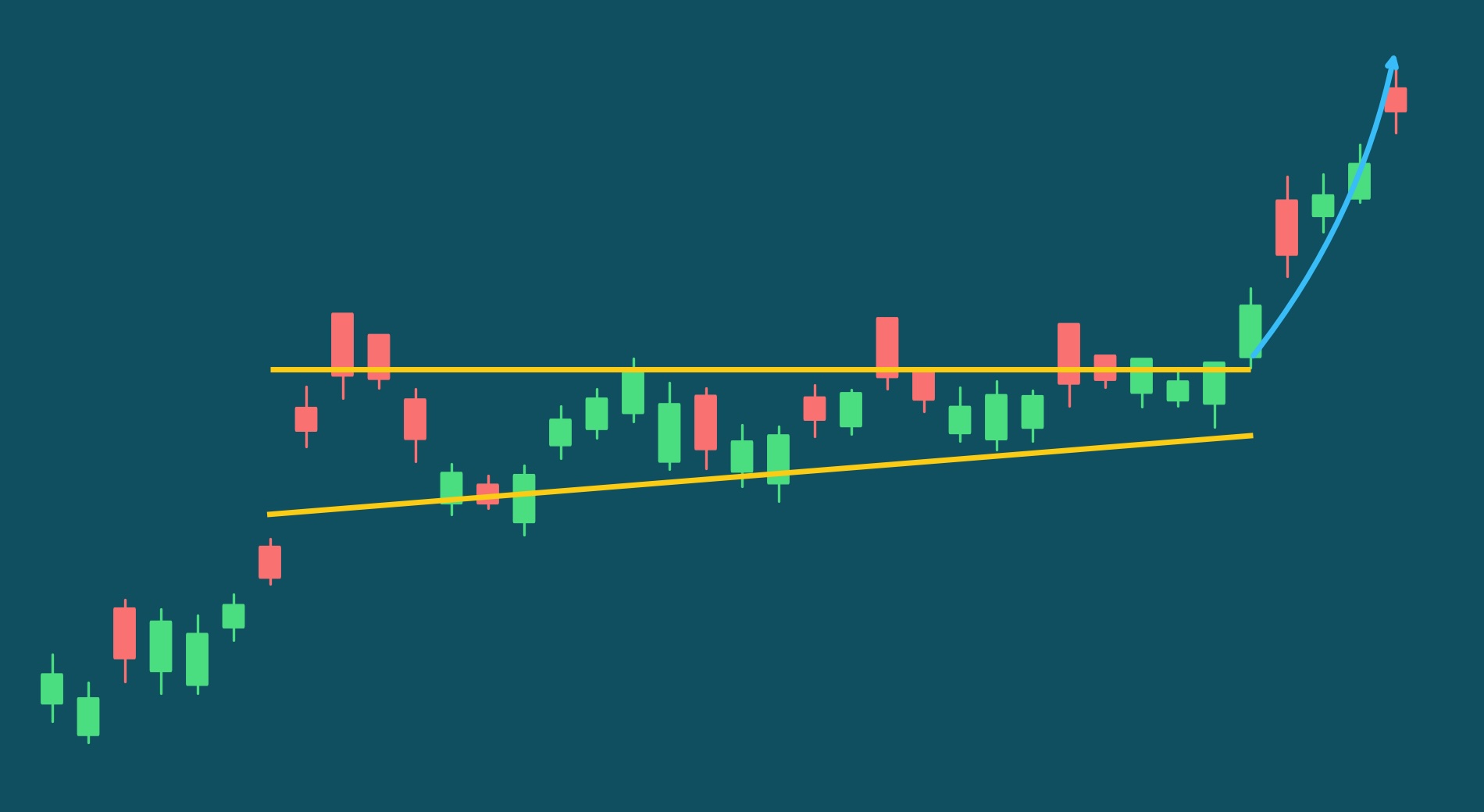
Category: Continuation
What it looks like: Price makes a series of higher lows (creating a rising support trendline) while repeatedly testing the same resistance level (flat or nearly flat top). The pattern compresses into the apex where these lines converge. Duration is typically 3 to 12 weeks, and you need at least two touches on each trendline for the pattern to be meaningful. Volume usually declines during formation as the range tightens. Go here for more information.
What it signals: Buyers are increasingly aggressive. Each pullback gets purchased at higher prices. The flat resistance represents supply (sellers willing to exit at that price) that's gradually being absorbed. With each test of resistance, the available supply at that level diminishes. When that supply finally exhausts, price breaks through with reduced overhead selling pressure, often producing a clean move higher.
From our data: Ascending triangles appear in 24% of our daily continuation detections. Our data shows a 64% market beat rate for ascending triangles meeting our quality threshold. Successful breakouts on average generate a return of 5.6%.
Common mistakes:
- Drawing resistance lines through exact highs rather than the general resistance zone. Real charts are noisy. If you require the price to touch the exact same level to the penny, you'll miss most valid triangles. Look for a zone where sellers consistently appear, not a single price point.
- Requiring perfectly rising lows. Real ascending triangles have noise. Not every single low will be higher than the previous one. What matters is the general trend of rising support, not geometric perfection.
- Entering too early before decisive breakout with volume confirmation. The triangle's compression phase can last weeks. Just because price is near resistance doesn't mean the breakout is imminent. Wait for a decisive close above resistance, ideally with volume expanding to confirm that the breakout has real participation behind it.
- Overvaluing resistance touch count. Intuitively, more touches on resistance "proves" the level is important. But more touches also mean more market participants have observed the same pattern. Widely recognized resistance levels tend to attract crowded trades: everyone sets the same entry orders just above resistance. Patterns with just two or three resistance touches can be more powerful because fewer traders are positioned for the breakout.
Quick tip: The breakout candle itself is one of the best confirmation signals. A strong close well above resistance, with the stock finishing near the top of the day's range, indicates genuine conviction. If the stock pokes above resistance intraday but closes back below it, that's a failed test, not a breakout. Also watch where the stock is relative to its moving averages: ascending triangles that form while the stock is above its key moving averages tend to resolve more cleanly than those forming in a weaker technical position.
5. Higher Lows Volume Spike Pattern
Category: Momentum
What it looks like: A stock spends 15-30 days building a quiet base where each successive low is higher than the last, while volume gradually dries up. Then, volume suddenly awakens, usually a moderate spike of 1.5-2.5x average, as price pushes off the base with strong momentum. Think of it as a coiled spring: the base tightens, volume contracts, and the eventual release comes with renewed buying interest. You might also want to learn about the volatility compression pattern.
What it signals: Institutional accumulation happening under the radar. Big buyers are patiently building positions during the low-volume consolidation, which creates the higher lows pattern. Each dip gets bought sooner and at higher prices. The volume spike represents the moment supply finally exhausts and demand overwhelms, often triggering a multi-day breakout. Unlike patterns that rely on a single dramatic event, this one tells a multi-week story of conviction building beneath the surface.
From our data: This is one of our more frequent detectors, it fires about once to twice per day, accounting for about 50% of our momentum breakouts. At two weeks, the pattern beats market trends about 60% of the time. A good setup can generate about 5.2% return over two weeks.
Common mistakes:
- Chasing extreme volume spikes: Counterintuitively, moderate volume spikes (1.5-2.5x average) significantly outperform massive 5x+ spikes. Extreme volume often signals news-driven moves that quickly reverse, not organic accumulation completing.
- Counting higher lows without measuring slope: Simply counting how many days show higher lows doesn't predict success. What matters more is the steepness and consistency of the rising support. Ask yourself: “Are buyers stepping in more aggressively each time?”
- Ignoring the close: Where price closes within the day's range on the breakout day is a strong signal. Stocks closing near their daily high (strong close strength) show much better follow-through than those giving back gains by end of day.
- Accepting bases that are too wide: If the base range relative to ATR is too large, the pattern loses its "coiled spring" quality. Tighter bases (lower base-range-to-ATR ratio) produce better breakouts because they represent genuine compression rather than wide, sloppy consolidation.
Quick tip: The best Higher Lows + Volume Spike setups are the boring ones. You want to see volume steadily declining during the base, significant contraction from pre-base levels paired. Ideally, you will see small daily ranges that show the stock is being quietly accumulated, not actively traded. The breakout day should feature positive one-day momentum with the stock closing near its high. If the volume spike comes with a weak close (giving back most of the day's gains), that's a warning sign, not a confirmation.
6. Breakaway Gap Pattern
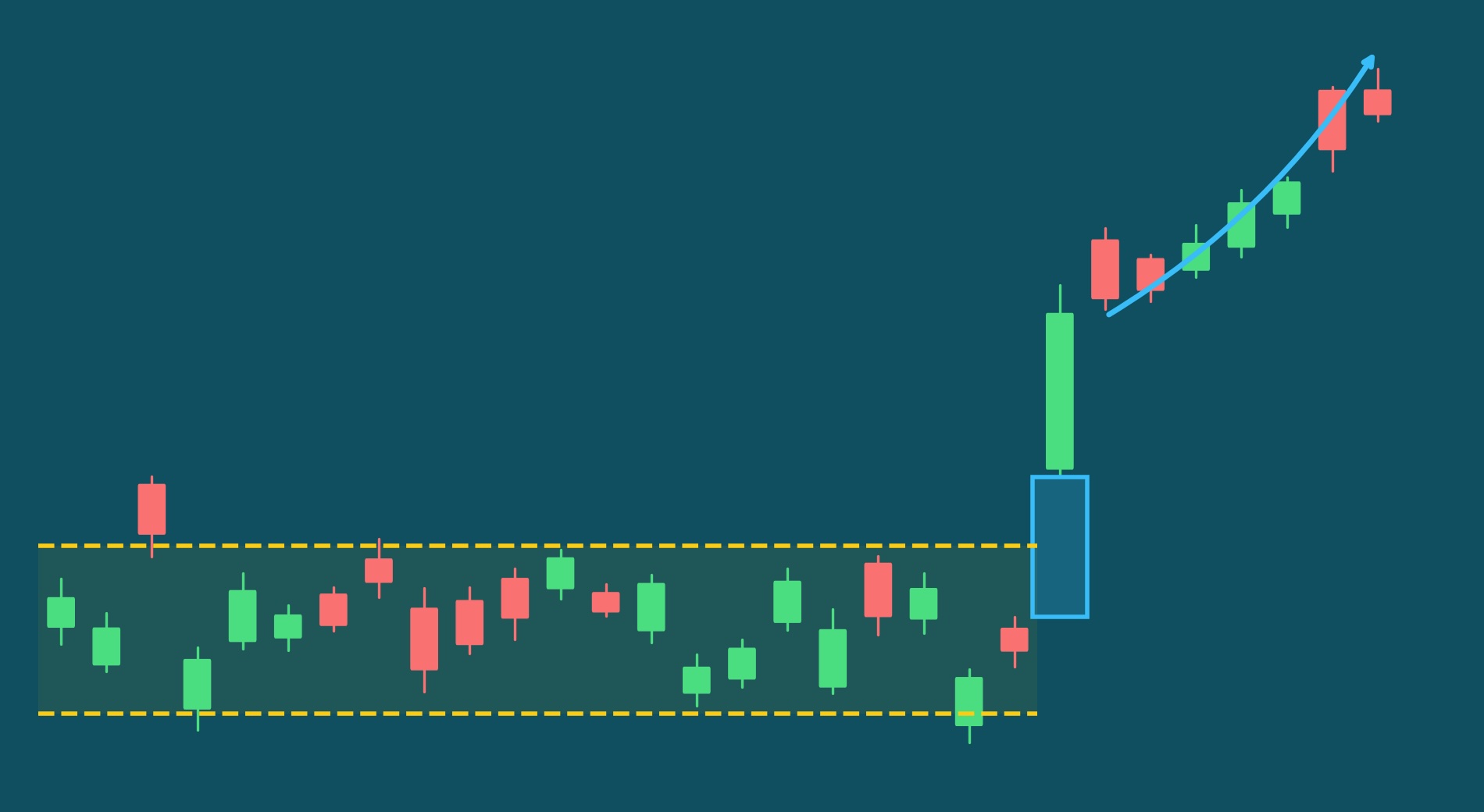
Category: Momentum
What it looks like: Price opens significantly higher than the previous day's close, leaving a visible empty space ("gap") on the chart. This isn't a small overnight drift, we're talking about meaningful gaps of 3% or more. The gap occurs after a period of consolidation or base-building and is accompanied by unusually high volume. The stock should hold above the gap through the trading day, not fill it immediately.
What it signals: A decisive, overnight shift in supply and demand. Something material changed, such as earnings, news, institutional positioning, that caused buyers to overwhelm sellers before the market even opened. The gap represents prices where no trades occurred because demand jumped the entire range. Unlike common gaps that occur in the middle of a range and quickly fill, breakaway gaps at the start of new trends often don't fill for weeks or months. They mark a clean break from the prior price structure.
From our data: We detect approximately three breakaway gaps per day across the market. High-quality breakaway gaps beat the market about 66% of the time. The average return on a breakout is 3.4%. This is one of our more selective patterns — the requirements for gap size, volume confirmation, and context are strict, which keeps detection frequency lower than patterns like bull flags.
Common mistakes:
- Assuming all gaps fill. This is one of the most persistent myths in trading. While common gaps and exhaustion gaps do tend to fill, breakaway gaps — those launching a stock out of a consolidation base into a new trend — often don't fill for a long time. Trading the "gap fill" on a genuine breakaway gap means shorting into the start of a new uptrend.
- Confusing breakaway gaps with exhaustion gaps. Exhaustion gaps occur after an extended run and often do fill. The difference is context: a gap after 3 months of consolidation is likely breakaway; a gap after a 40% run is likely exhaustion. Where the gap occurs in the stock's recent price history matters as much as the gap itself.
- Not confirming volume. True breakaway gaps have significantly higher volume than recent trading days. The volume spike confirms that real money, not just a few trades in the pre-market, is behind the move.
- Ignoring where the stock closes on gap day. A stock that gaps up strongly but then gives back most of its gains by the close is showing you that buyers couldn't maintain control. The strongest breakaway gaps close near their highs, indicating sustained demand throughout the session.
Quick tip: The most powerful breakaway gaps occur when the stock breaks out of a multi-week or multi-month base. A gap out of a 3-day consolidation is less meaningful than a gap out of a 3-month base: the longer the compression, the more significant the release. Also look at what happened to volume before the gap: bases that show a U-shaped volume pattern (high volume entering the base, declining through the middle, then rising into the gap) tend to produce more sustained moves than bases with erratic volume behavior throughout.
7. Flat Base Pattern
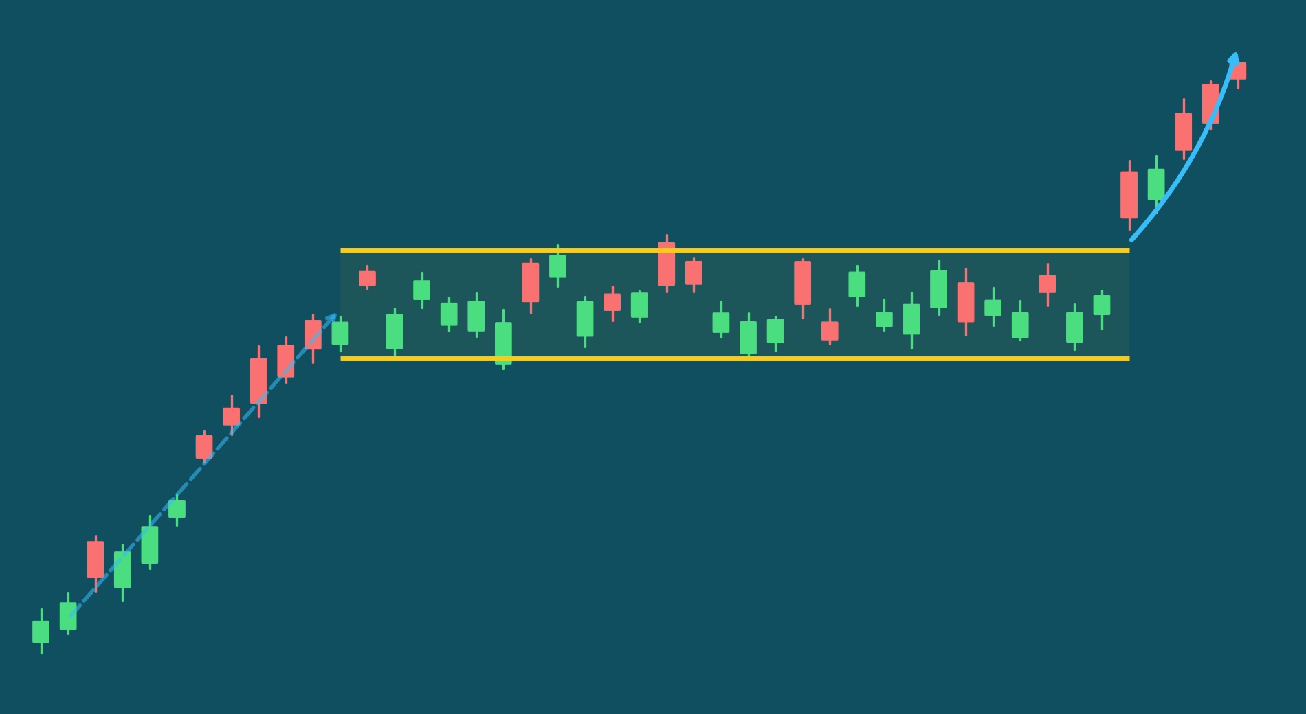
Category: Continuation
What it looks like: A stock that has been in a strong uptrend pauses and trades sideways for 4-14 weeks in a narrow range, usually 5-25% from high to low, while remaining close to its 52-week highs. The base looks almost boring on a chart: no dramatic drops, no wild swings, just a tight horizontal channel where the stock digests its prior gains. The channel could have a slight positive or slight negative gain. Volume steadily dries up during the consolidation, then expands as price pushes above the base's ceiling.
What it signals: Strength hiding in plain sight. When a stock has made a significant run and then goes sideways rather than pulling back sharply, it means sellers are exhausted and holders are refusing to take profits. The flat, tight price action tells you that supply and demand have reached equilibrium near the highs. Nobody is panicking. Meanwhile, volume contraction shows that the casual sellers have already moved on. The breakout above the base high represents that equilibrium finally tipping in favor of buyers, often as institutional investors finish accumulating their positions.
From our data: The flat base detector is one of our more selective patterns due to multiple structural requirements. We only detect it about once every three days. Good setups beat the market about 65% of the time with an average return of 4.3% on positive breakouts.
Common mistakes:
- Confusing a flat base with a stock going nowhere: The key distinction is what happened before the base. A true flat base follows a meaningful uptrend. Without that prior move, a sideways stock is just sideways. There's no accumulated energy waiting to release.
- Requiring the base to be perfectly flat: A small upward or downward slope is normal and acceptable. Trying to find laser-flat bases eliminates too many valid setups. What matters is the range staying tight, not that every close is identical.
- Ignoring compression signals: Our data shows that the most predictive setups that focus on compression indicators, such as tightening price ranges and declining volatility, are often more predictive than the base's shape alone.
- Jumping in before the breakout is confirmed: Confirm that the price is close to the base high (less than 5%) and trending up. The more resistance tests without follow-through, the more caution is warranted.
Quick tip: The best flat bases are the ones where volume tells a clear two-part story. During the base, you want to see volume drying up, ideally 20-30%+ below the pre-base average, with a declining trend. On the breakout day, you want the opposite: volume expanding to 1.5x or more. Flat bases that feel "boring" on the surface but show rising OBV and momentum acceleration underneath are the ones most likely to produce meaningful breakouts.
The Seven Patterns for Beginners at a Glance
For easier comparison, here is how all seven chart patterns compare:
| Pattern Name | Category | Detections Per Day | Market Beat Rate | Avg. Win Gain |
|---|---|---|---|---|
| Bull Flag | Continuation | 2.6 | 72% | 6.4% |
| Three White Soldiers | Candle Stick | 2.3 | 70% | 5.5% |
| Symmetrical Triangle | Continuation | 0.2 | 68% | 6.0% |
| Ascending Triangle | Continuation | 1.2 | 64% | 5.6% |
| Higher Lows Volume Spike | Momentum | 1.6 | 60% | 5.2% |
| Breakaway Gap | Momentum | 0.5 | 66% | 3.4% |
| Flat Base | Continuation | 0.4 | 65% | 4.3% |
We hope that this table can help you prioritize which patterns to start off with first.
Patterns We Deliberately Excluded from this Article
Several famous patterns didn't make this list. Not because they don't work, but because they're not where beginners should focus:
Head and Shoulders: The most discussed reversal pattern rarely forms in clean, tradeable ways. When it does appear clearly, it's often late in its formation. We detect 15 head and shoulders patterns per month versus 33 ascending triangles per month. The frequency difference alone makes ascending triangles more practical for beginners.
Wedges and Pennants: These require more nuanced interpretation. The difference between a wedge, a pennant, and a flag can be subtle, and beginners often misclassify them. Better to master flags and triangles first.
Complex Harmonic Patterns: Gartley, Butterfly, Bat—these require precise Fibonacci measurements and significant experience to trade correctly. They're interesting but not practical for beginners.
At Stockdataanalytics, we detect additional patterns beyond these seven, but they require more experience to interpret and trade effectively. As you grow more comfortable, you can explore our full pattern library.
How to Practice Pattern Recognition
Before risking real money:
Study historical charts. Pick one pattern. Go back 6-12 months on various stocks and find 20+ examples. Note what happened after each. Notice how messy real patterns look compared to textbook illustrations.
Paper trade systematically. When you spot a pattern forming in real-time:
- Write down the stock, pattern type, entry price, stop loss, and target
- Note why you think this is a valid pattern
- Record the outcome
- Do this for at least 50 patterns before trading real capital
Focus deeply, not broadly. Spend two weeks focused only on bull flags. Don't look for other patterns, just flags. Then two weeks on ascending triangles. Single-pattern focus builds recognition faster than scanning for everything.
Track your accuracy. Were you right about the pattern (did it actually break out)? Were you right about direction? Were you right about magnitude? These are different skills.
The Real Challenge: Timing
Recognizing patterns is the easy part. The hard part is finding them in that narrow 1-3 day window when the setup is complete but before the breakout runs.
There are 6,000+ actively traded U.S. stocks. Even focusing only on these seven patterns, you cannot manually scan everything. By the time most traders find a setup through weekend scanning or end-of-day reviews, the optimal entry window has often closed.
This is why we built StockDataAnalytics: to solve the timing problem through systematic detection at scale. Every business day before the market opens, we surface the highest-quality pattern setups across the entire market, scored and ranked by probability.
A Word of Caution
It is worth noting that no pattern is 100% fail-safe. Some of our top detections show a predicted win rate of 80% which is great. But that also means that one out of five detections will be wrong. Wrong could mean that the price trends the wrong way - sometimes steeply. Some of these moves are explosive.
It’s important to protect yourself against this happening. Successful traders don’t always understand the markets better - they are disciplined. Before they enter they have a plan. They made a decision when to exit the position if the price drops and they have a similar plan to exit when the price rises. They do it when they have a clear head and their thinking is not clouded by emotions. Learn from those traders and make a decision on:
- Stop Loss: This is the price at which you will exit if the price keeps dropping after you purchased. Stick with that price - don’t adjust it lower as the price drops.
- Target: This is the price at which you will exit if the price keeps increasing. If a stock goes up fast we can get greedy. Be careful - the gains could be lost just as fast. Stick with your plan - or at least raise the stop loss to guarantee some wins.
- OCO Orders: One-Cancels-the-Other (OCO) Order are a way to play it safe. When setting up a trade you can setup a stop loss and a target order at the same time. As soon as one gets executed, the other gets canceled, allowing you to automatically cut your losses or cash in on your wins. When picking a trading platform, consider this feature.
Whatever you do, have a plan of how you will manage investment risk to a level you are comfortable with. Be smart and have fun trading.
Get Started
You now know the seven patterns that matter most for beginners. The next step is practice. Start with historical charts, move to paper trading, and eventually trade small positions as you build confidence.
You now know what to look for. The challenge is finding these patterns across 6,000+ stocks in the 1-3 day window when they're actionable. That's what StockDataAnalytics solves: Every business day, our algorithms scan the entire market and deliver the highest-quality setups to your inbox before the opening bell. Try it free and see what patterns are forming right now.
Disclaimer: StockDataAnalytics.com is a financial data and analytics service. The information provided through our platform, including stock pattern detection, entry zones, stop losses, and price targets, is for informational and educational purposes only and does not constitute financial advice, investment advice, trading advice, or any other type of advice. We are not registered investment advisors, broker-dealers, or financial planners. Past performance of any pattern or recommendation does not guarantee future results. All investments involve risk, including the possible loss of principal. You should consult with a qualified financial advisor before making any investment decisions. By using our service, you acknowledge that all trading decisions are made at your own risk.