
We analyzed 370,000 chart pattern detections. The result? Textbook-perfect setups underperform messy ones. Here's what actually predicts gains.
Introduction
If you've ever spotted a textbook bull flag, bought the breakout, and watched it immediately reverse, you're not alone. We discovered why:
At StockDataAnalytics.com we originally built a stock pattern scanner with a 32-point scoring system. As the system stabilized and focused on fine-tuning prediction performance we learned that imperfect stock patterns detected outperformed textbook patterns: we noticed that while patterns scoring above 30 (what we defined as textbook patterns) were significantly underperforming compared to lower scoring (imperfect) patterns. We learned that our system inadvertently provided scenarios that were going to lose any future customer money.
Through our live detection system and our stock pattern backtesting system we have recorded and analyzed over 370,000 scenarios where one of the 16 stock patterns we search for were detected. What we learned is that imperfect chart patterns provide a much larger opportunity and we have since shifted strategy to focus on those scenarios. We will explain reasons for why imperfect stock patterns outperform perfect ones later on.
Why Textbook Chart Patterns Fail: The Crowded Trade Problem
When we first started analyzing stock data for NYSE and NASDAQ we were impressed how efficient these markets are: stock prices move on news almost immediately and by the time a reasonable user of our system would digest the data we shared, there is a good chance that any information that is publicly known was already priced into the stock price. Consider this: every major investment house and bank in the US has an investment arm that is heavily staffed with software engineers, economists and quant analysts analyzing the data and building systems that react to the insights within seconds. Besides the trading staff of large financial institutions there are a lot of individual investors out there, having their own strategies to beat the market. That means a lot of eyeballs watching the same charts you do, matching to the same textbook chart patterns you know about - everybody trying to cash in. Hence easy-to-spot scenarios are well known in the market and are acted on almost immediately. The more imperfect the pattern - the less people observe and act on it.
We found that predicting deviations of a stock price from its long-term value had an opening. In addition we found that institutional investors, when adjusting their positions, are accomplishing those changes in a large number of smaller transactions in order to avoid the market understanding their intention and reacting to it. While this is quite an effective strategy, those investors leave trails that can be picked up with advanced statistics.
Why This Matters for Individual Investors
The findings in this article have practical implications:
-
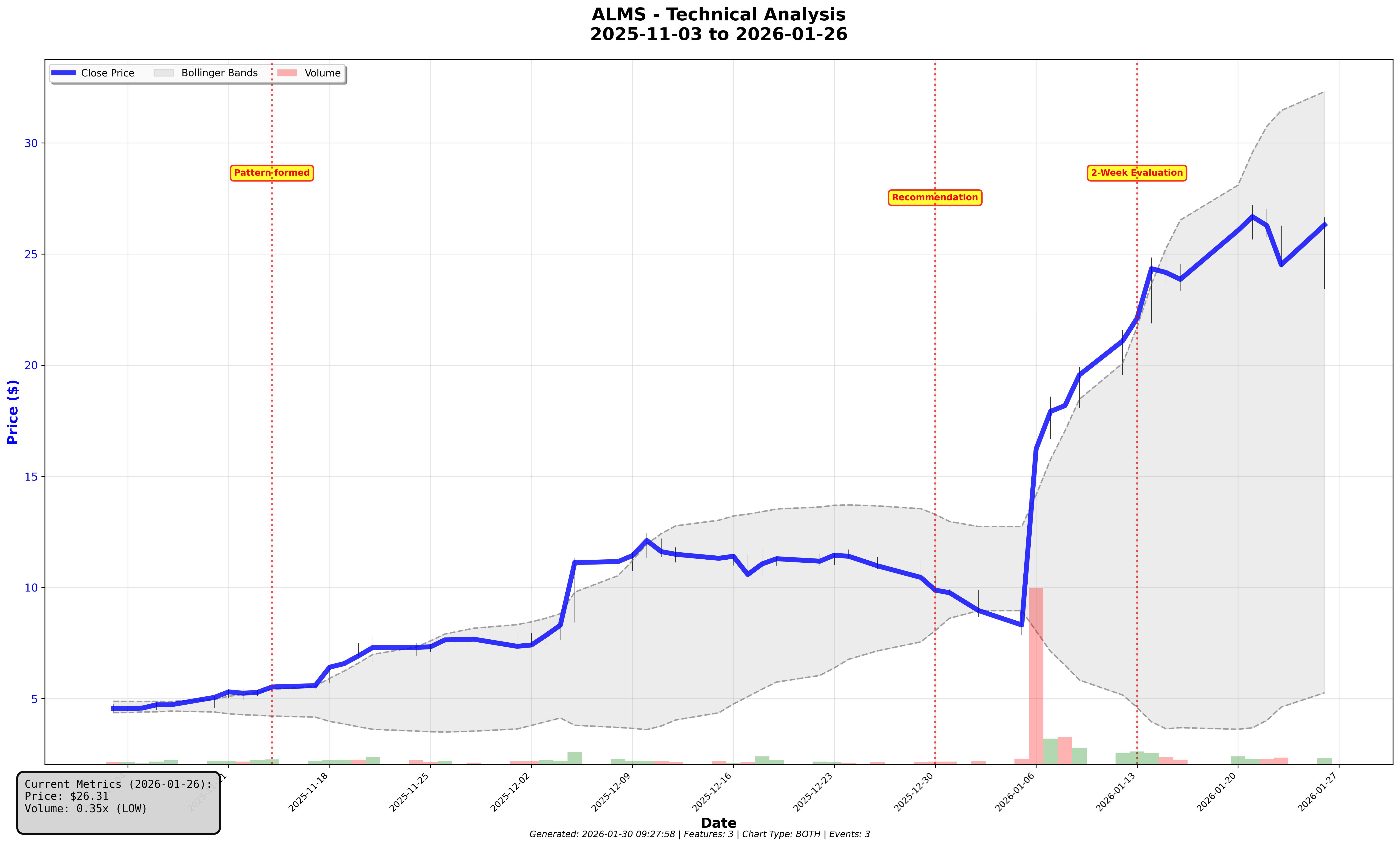
Don't chase obvious setups. If a pattern is textbook-perfect and you spotted it easily, assume professionals spotted it first and already acted on it. When you see a pattern with 6+ resistance touches and everyone on FinTwit is posting it, that's your signal to skip it. The stock pattern that made us the most money in the last four weeks was a bull flag detection for ALMS (see image above). Textbook standards reject this scenario because of the pole gain (which is too parabolic) and the flag range of 25% (much looser than the less than 10% recommended).
-
Pay attention to volume behavior during formation, not just at breakout. Quiet accumulation (moderate volume contraction) often precedes better breakouts than loud volume spikes. In our Volatility Compression detector, patterns with lower volume ratios, still above 1.0, beat the market 80% of the time. The 'quiet' setups are showing the highest potential.
-
Be skeptical of "confirmation." More resistance touches, longer pattern duration, and bigger volume spikes all sound like confirmation - but our data shows they often indicate crowded trades and resulting lower performance.
-
Imperfect chart patterns require systematic detection. The setups that outperform are often hard to spot manually. This is where algorithmic scanning provides an edge.
How we measure Performance
It is worth clarifying a few terms before discussing detailed observations. Our target customer is the short-term investor who is interested in capitalizing on short term deviations from the long-term price trend. Hence, when we talk about performance, we are usually looking at the stock gain over the subsequent two weeks. A 10% return is defined as a stock price growing by 10% over that time period.
When we discuss market beat rate we are usually comparing the performance of our recommendation(s) compared to the growth of the market during the same timeframe. Any recommendation(s) that create a larger return than the market we assess as beating the market. We assess financial returns as beta adjusted maximum favorable excursion (MFE), meaning what was the delta to the highest close during the subsequent two week period. We adjust those returns based on the stock beta to account for stock volatility.
All findings pass institutional-grade statistical validation, direction consistency across time periods, minimum effect sizes, and correction for multiple comparisons. For more details, please review the appendix at the end of the article.
Chart Pattern Backtesting Findings
Ascending Triangle Pattern: Why Fewer Touches Perform Better
One of the stock patterns we detect is the Ascending Triangle (see prior article here). Conventional wisdom describes this as an upward pattern where the stock price has a repeated pattern of consolidation (flat or slight decline) and growth (stock price growing significantly). It is generally accepted that more touches on the ascending line for lows and highs is better. However, we found that two touches actually outperforms patterns with more touches. In our example we found that recommendations with two touches beat the market about 55% of the time while the ones with five to six touches beat the market only 40% of the time. The same trend could be observed when evaluating investment returns. We believe that each touch increases the visibility of the scenario and creates more interest, resulting in less returns for the individual investor.
Rounding Bottom Pattern: Why Deeper Bottoms Outperform
When analyzing our rounding bottom pattern detection we noticed something interesting: We learned that deeper bottoms (up to 50%) show much more opportunity than rounding bottoms with a shallow bottom of 15% or less, which is what technical analysis textbooks recommend. When looking at investment return, we found that deeper patterns outperformed more shallow patterns by a ratio of 6:1. The adjustment to our scoring resulted in a 2x improvement of our correlation of outcome metrics to the pattern quality score.
Breakout Timing: Why Big Initial Moves Often Fail
We consider these events “loud starts” where a breakout happens with an initial large jump in price. Staying with the overcrowded trade context above, we found that such breakouts attract a lot of attention. For example, when reworking our Falling Wedge pattern we found that detections where the most recent date showed a 3% or more gain in stock price only had a 17% likelihood of continuing on an upward trend, while scenarios which showed less than a 3% increase had a 50/50 chance of continuing an upward trend. The reason for that finding is that the large initial move likely consumed the momentum meant for the actual breakout, while simultaneously attracting attention that turned the trade into a crowded one.
Volume Analysis: Why Moderate Spikes Beat Extreme Ones
One of the biggest learnings we had about volume was that you cannot apply volume characteristics the same across every pattern. Volume behaves differently by pattern and those nuances are where we found opportunities to improve our scoring models.
Moderate volume spikes beat extreme ones: While spikes in volumes still signal that a stock is about to move, we found that in most scenarios volume spikes of 1.5x to 2.5x are much more predictive than larger or smaller volume spikes. One specific example was when we reworked our Volatility Compression Detector: our scoring model was rewarding larger volume spikes. When comparing to market outcomes we found that lower volume scores had much higher performance outcomes. We believe that volume spikes at that level are much harder to spot and hence point towards less crowded opportunities.
Volume on up days vs. down days: One interesting metric we found was separating volume for days where the price went up vs. days where the price went down. We are tracking the ratio between volume during up days and volume during down days as a potentially predictive metric.
Large shifts in volume ratio: This is in-line with the loud start topic above, we have found sharp increases in volume right before a breakout event resulting in less significant long breakouts. The sweet spot here is the volume ratio of 1.5 - volume ratios between 1.0 to 1.5 showed much better subsequent performance in several of our chart patterns compared to volume ratios above 1.5.
Inversion to textbook behavior: One specific example was when we reworked our Volatility Compression Detector: patterns receiving our lowest volume scores (1-2 points) beat the market 80% of the time, while those receiving our highest scores (7-8 points) beat the market only 63% of the time - a 17 percentage point spread in the wrong direction. Our scoring was actively selecting worse opportunities.
Scenarios where volume has no predictive value: We have found patterns where volume had no predictive value to improve the overall score. One example is our Bull Flag detector, we found that winners averaged a volume score of 7.83 points while losers averaged 7.82 points - virtually identical. Our volume scoring wasn't measuring the wrong thing badly; it was measuring the wrong thing entirely. In this scenario we are substituting raw volumes with volume related metrics.
Stock Pattern Myths: What our Data disproved
Not every hypothesis survived our validation process. Several intuitively appealing metrics showed no predictive value:
-
Pattern symmetry (Double Bottom): We expected more symmetrical bottoms to perform better. The data showed no correlation.
-
RSI at detection: Oversold conditions (RSI < 30) didn't predict better outcomes than neutral readings.
-
Days in pattern: Longer formations didn't outperform shorter ones after controlling for other factors.
These failures reinforced our commitment to empirical validation over theoretical elegance.
How We Built a Better Stock Pattern Scanner
Our scoring models are not static. Every pattern detection feeds back into our analysis system. We track:
-
Daily market beat rates by pattern type
-
Scoring component correlations with outcomes
-
New metric hypotheses generated from pattern behavior
When we identify scoring inversions or zero-correlation components, we redesign them. The Rounding Bottom depth adjustment that produced a 2x correlation improvement came from exactly this process: detect the problem, analyze the data, validate the fix, deploy.
Conclusion: Why Imperfect Patterns Win
The simple truth is that textbook patterns don’t give you an edge over the market. Everybody knows these patterns and observing these patterns is already priced into the value of the stock.
But why does StockDataAnalytics.com continue to leverage those patterns to create stock recommendations? We believe that there is a significant opportunity in imperfect patterns. This is what we are focusing on: We are relaxing requirements for stock patterns - so an ascending triangle we are detecting might be difficult to spot.
In one example a user recently asked about a three soldiers pattern we were sharing with our clients. The textbook definition requires three consecutive bullish (positive) candles. Our analysis found that requiring exactly three positive days was too restrictive - and didn't improve predictive power. We now detect chart patterns where each candle shows a return greater than -0.5%, allowing for slight pullbacks. In practice, a middle candle closing down 0.3% still qualifies if the overall pattern shows the accumulating momentum that defines Three White Soldiers. This 'imperfect' version actually performs better because it catches setups that human traders overlook.
This belief is validated by success metrics we are tracking daily and are leveraging to continually improve our scoring models. Our latest results show market beat rates ranging from 55% to 71% depending on market conditions, with average two-week returns of 1.5% for a simple trading strategy of entering at the day of recommendation and exiting the first time either stop loss or the target is being touched.
As a result we've rebuilt our entire scoring system around these findings: 40 points across structure, breakout readiness, and volume, calibrated to what actually predicts gains rather than what looks good on a chart. We only leverage the textbook pattern definition as a starting point to collect the initial data set. Only the metrics that show true predictive value for building a highly predictive scoring model are included in the final detector.
The Three White Soldiers example above isn't an exception, it's our standard approach. Every one of our 16 pattern detectors has been rebuilt based on what the data shows, not what the textbooks say. Ascending triangles with fewer touches. Rounding bottoms with deeper depths. Volume characteristics that would make a traditional chartist uncomfortable. We share these recommendations daily with subscribers. If you'd like to see what data-driven pattern detection looks like in your inbox each morning, start a free six-week trial at StockDataAnalytics.com.
Appendix: How we protect against overfitting
When detecting interesting findings, we apply institutional-grade statistical validation to ensure our findings aren't just noise. These include:
-
Bonferroni correction test (A statistical adjustment that raises the significance bar when testing many metrics at once, reducing the chance of mistaking random noise for real findings) with a threshold of P < 0.05/(n features), meaning P < 0.003 when testing 17 features simultaneously
-
Effect Size: absolute Cohen’s d > 0.3
-
Direction consistency: Results in training and validation datasets must point in the same direction. If a metric predicts success in training but failure in validation, it’s most likely noise.
-
Minimum sample size: When bucketing data — no bucket can have less than 75 observations. For example, our Ascending Triangle analysis included over 12,000 pattern detections, while Rounding Bottom analysis covered 13,000+ patterns. When we are short on pattern detections to train a model we usually go further back to collect more data.
While these are strict standards and plenty of initial findings are not passing these requirements, we can be confident that findings passing those tests can be trusted.
The direction consistency test proved to be our most valuable protection against false discoveries. Many metrics that showed strong predictive power in training data completely reversed in validation data - what predicted success in one period predicted failure in another. Any feature showing this 'direction flip' was automatically rejected, regardless of how promising it looked initially. This single rule eliminated more than half of our apparent discoveries.
Disclaimer: StockDataAnalytics.com is a financial data and analytics service. The information provided through our platform, including stock pattern detection, entry zones, stop losses, and price targets, is for informational and educational purposes only and does not constitute financial advice, investment advice, trading advice, or any other type of advice. We are not registered investment advisors, broker-dealers, or financial planners. Past performance of any pattern or recommendation does not guarantee future results. All investments involve risk, including the possible loss of principal. You should consult with a qualified financial advisor before making any investment decisions. By using our service, you acknowledge that all trading decisions are made at your own risk.