Introduction: Why Volatility Compression Is Our Most Reliable Pattern
Of the 16 bullish stock chart patterns we detect, one consistently stands above the rest. Not because it's exotic or complicated — but because it appears most often and, when properly identified through systematic pattern detection, produces the most consistent breakout results. Volatility compression patterns represent 53% of our daily stock recommendations, and after tracking approximately 1,100 occurrences over the past month, they show a 63% market beat rate.
At StockDataAnalytics, we've built an algorithmic pattern detection system that scans 6,000+ stocks across NASDAQ and NYSE daily, searching for high-probability breakout setups. This is Part 3 of our pattern detection series. In Part 1a, we discussed the execution problem technical traders face — how life gets in the way of catching stock setups at the right moment. In Part 1b, we explained our technical architecture: the 16 bullish patterns we detect, our three-dimensional scoring methodology, and the engineering challenges we solved. Now we're diving deep into our most reliable stock pattern, explaining exactly what our algorithm looks for and how we separate high-probability breakout setups from market noise.
Important Disclosure: This is educational content about technical analysis methodology, not investment advice. We are not financial advisors. All trading involves substantial risk of loss. Consult a qualified financial professional before making investment decisions.
How should the Volatility Compression Pattern be interpreted in Stock Trading?
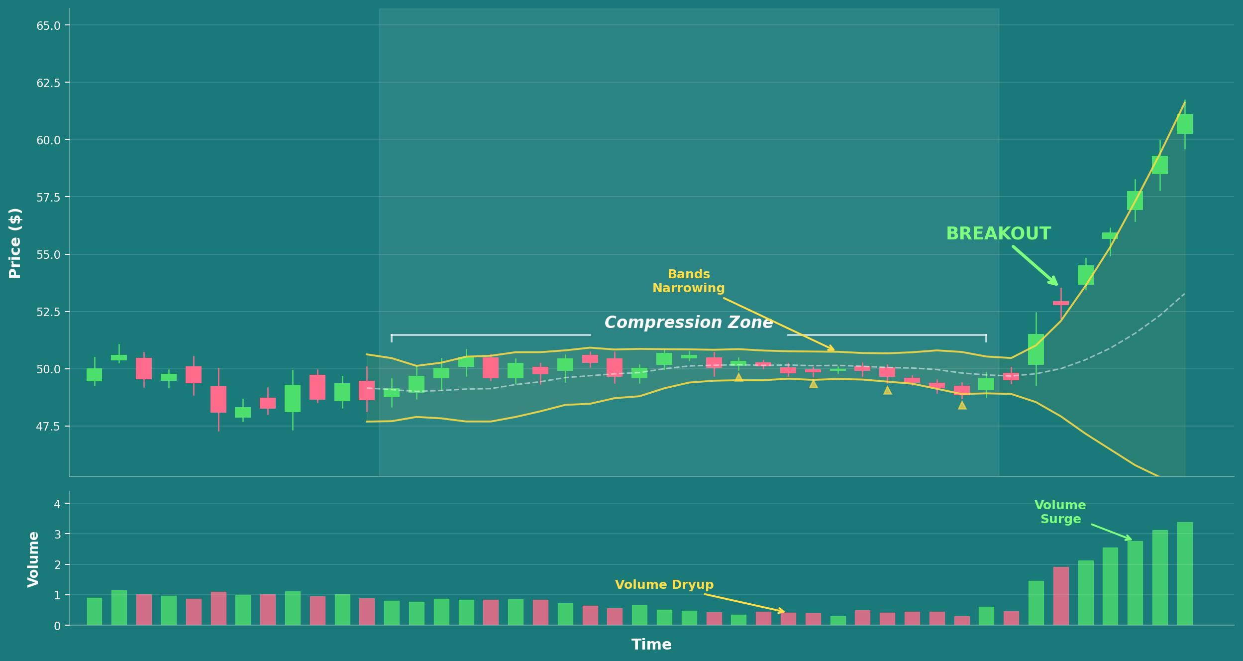
Volatility compression occurs when a stock's daily price range narrows progressively over time. Day after day, the daily highs and lows get tighter and tighter. The stock isn't going anywhere — it's trapped in an increasingly narrow trading band. Volume typically declines during this compression period as traders lose interest and move on to more exciting opportunities elsewhere. It's like a coiled spring storing energy, building pressure that will eventually release in a sharp price move.
How Technical Indicators Reveal Volatility Compression
Several widely followed technical indicators reveal when compression is happening in a stock. Bollinger Bands squeeze together, reaching their narrowest bandwidth in weeks or months — often referred to as a "Bollinger Band squeeze." Average True Range (ATR) declines steadily as daily price swings shrink, signaling decreasing volatility. Each day's high-low spread gets progressively smaller. Volume drops below its 20-day moving average as trading interest wanes.
To the casual observer scanning stock charts, these stocks look boring. Nothing's happening. That's exactly the point — and that's exactly what our stock pattern scanner is designed to find.
The Coiled Spring Analogy: Understanding Breakout Potential
Think of a rubber band being stretched. The more you pull it back, the more potential energy builds. When you let go, it snaps forward with force. Volatility compression is the stock market equivalent — price gets squeezed into a tighter and tighter range until it has to move explosively in one direction. The question isn't whether it will move, but when and which direction the breakout occurs.
Why Most Retail Traders Miss Volatility Compression Setups
Retail traders typically miss volatility compression patterns for several important reasons. First, the stocks are boring to watch — nothing happens day after day, which tests even experienced traders' patience. Second, false starts frustrate traders who enter positions too early, causing them to abandon the pattern entirely before the real breakout develops. Third, by the time the actual breakout is obvious to everyone watching the chart, it's often too late — the stock has already moved 10–15% above the compression range.
This pattern requires a level of patience most discretionary traders don't have, combined with systematic, algorithmic detection to catch it at precisely the right moment. That combination of patience and precision is what makes automated stock pattern detection so valuable for volatility compression trading.
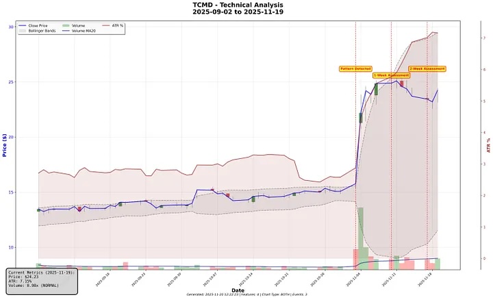
In the above chart you can see an example of such a stock pattern for ticker TCMD (Tactile Systems Technology, Inc.). You can see how the band compresses starting in early October and how the stock's trade volume is low untl the breakout day, when trade volume expands and the price is moving upwards sharply.
Why Volatility Compression Breakouts Work: The Edge Explained
Over the first half of November, we tracked approximately 550 volatility compression patterns across all market capitalizations. 63% outperformed the S&P 500 over the subsequent week. That's not random chance — that's a statistically significant trading edge.
Our subscribers receive these pattern detections before market open each day. Learn more about the information our clients receive or sign up for early access.
This pattern delivers an edge for three fundamental reasons, each supported by both market microstructure theory and our empirical backtesting data.
1. Supply and Demand Equilibrium Breaks Down
When a stock compresses, buyers and sellers are in temporary equilibrium. Neither side has enough conviction to push price decisively higher or lower. But equilibrium in financial markets never lasts indefinitely. Eventually, one side overwhelms the other — new information arrives, market sentiment shifts, or larger institutional players make their move. The volatility compression tells us a decision point is approaching. Our pattern detection system positions subscribers to be ready when the equilibrium breaks and the breakout occurs.
2. Institutional Accumulation Happens During Quiet Periods
Large institutional investors can't buy or sell huge positions without moving the stock price. If a fund wants to accumulate 5 million shares, they can't simply hit the buy button — they'd push the price up significantly as they bought. Volatility compression periods provide ideal cover for institutional accumulation. Low volatility, low volume, low market attention. Institutions can accumulate shares quietly over weeks without attracting notice or causing meaningful price movement.
When our system detects volume declining during compression followed by a surge on breakout, that signature often indicates institutions finishing their accumulation phase and letting the stock run. They've built their position over the quiet period. Now they're ready for the price to move.
3. Options Market Dynamics Create Self-Fulfilling Breakout Prophecies
Volatility compression often coincides with declining implied volatility in the options market. Options sellers get comfortable during the quiet period, writing strike prices close to the current stock price. When the breakout happens, these options dealers suddenly need to hedge their exposure. If they sold call options and the stock surges above the strike, they need to buy the underlying stock to hedge — a phenomenon known as "gamma squeeze" dynamics.
This forced buying amplifies the initial breakout move. Options market dynamics effectively turn volatility compression breakouts into self-fulfilling prophecies — the initial price move triggers hedging activity, which accelerates the move further, which triggers even more hedging.
This is why compression breakouts often move faster and further than other stock pattern types. The options market acts as an accelerant on the initial move.
How Our Algorithm Identifies Volatility Compression: The Three-Dimensional Scoring System
Every pattern detected by our stock pattern scanner gets scored across three dimensions: Structure (35%), Volume (40%), and Breakout Readiness (25%). Each dimension contains multiple factors, weighted based on what our backtesting data shows actually predicts breakout success.
A perfect score is 100. We typically only recommend patterns scoring 65 or higher. But not all high-scoring patterns are ready to trade immediately — the Breakout Readiness dimension captures that crucial timing element.
Dimension 1: Structure Score (38% of Total Pattern Score)
Structure measures the quality of the volatility compression itself. Is the stock chart pattern well-formed? Does it meet the geometric requirements that historically produce successful breakouts?
Volatility Compression Strength
This is the core measurement in our pattern detection algorithm. We calculate how dramatically the daily price range contracts during the consolidation period. Specifically, we compare the average daily range during compression to the prior trading period. Based on the level of compression detected, the pattern receives a score ranging from zero points (weak compression — less than 15% reduction in daily range) up to four points (extreme compression — more than 40% reduction in daily range).
Base Duration of the Consolidation
How long has the volatility compression lasted? Too short suggests a brief pause in the trend rather than genuine consolidation. Too long risks the pattern going stale as market conditions shift. The pattern receives between zero points (less than 10 trading days of compression) and three points (four to eight weeks of sustained compression).
Why these specific thresholds? Our analysis shows that patterns under 10 days are typically just brief pauses in price action, not genuine accumulation periods where institutional activity is occurring. Patterns that extend beyond 60 days often go stale — market conditions shift, the original catalyst loses relevance, and the setup loses its predictive power.
Base Range Tightness
We measure the consolidation range as a percentage of the stock's price. A stock oscillating between $90 and $110 has a 20% range. One consolidating between $95 and $105 has a 10% range — much tighter and more indicative of meaningful compression. This measure gets scored between zero points (greater than 25% range) and three points (less than 10% range).
Price Position Within the Compression Base
Where is the stock's current price within the compression range? This matters significantly for predicting breakout direction. We provide scores between zero (price sitting in the lower half of the range) and two (price in the top 20% of the range).
Why this matters for breakout probability: A stock trading at the lows of its compression range could break down just as easily as break up — the pattern is ambiguous. One trading near the highs is already showing relative strength — buyers are actively defending the base, keeping price elevated within the consolidation. We want to detect compression at the highs, not at the lows, because it signals bullish intent.
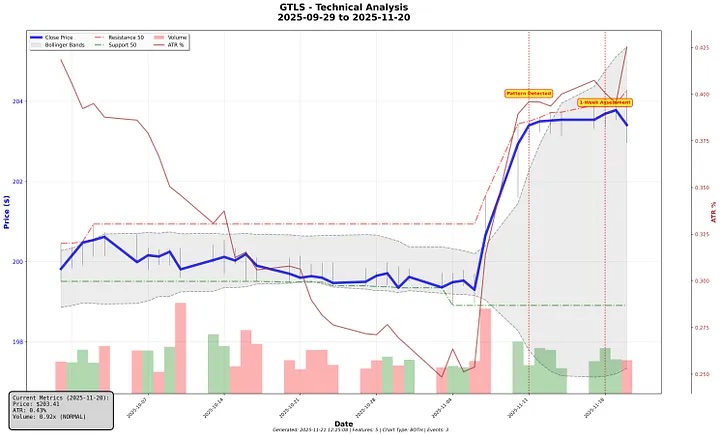
Real-World Structure Example: Chart Industries (GTLS)
Chart Industries provides a textbook example of high-quality volatility compression structure. The Bollinger Bands visibly tighten as volatility decreases, ATR steadily declines throughout the consolidation, and daily trade volume shrinks progressively during the compression period. Volume begins increasing on November 6th and more than doubles on November 7th, coinciding with a noticeable price increase above the resistance level — the classic compression-to-breakout sequence.
Dimension 2: Volume Analysis (31% of Total Pattern Score)
Volume is our highest-weighted scoring dimension for good reason. Volume tells the truth about what's actually happening beneath the surface of a stock chart. Price action can mislead — driven by a few large orders or algorithmic trading noise. Volume doesn't lie. It shows genuine conviction and institutional participation.
For volatility compression patterns specifically, our algorithm looks for a distinct volume signature: declining volume during the compression phase, then a surge in trading volume on the breakout.
Volume Dryup Strength During Compression
During healthy volatility compression, trading volume should decline significantly from the stock's average. This declining volume signals quiet institutional accumulation rather than distribution (selling). We assign between zero points (volume flat or increasing during compression) and five points (volume declines more than 60% from average).
For example: If a stock normally trades 500,000 shares daily but volume drops to 200,000 during the compression period, that's a 60% decline — extreme volume dryup indicating quiet accumulation. If volume stays at 480,000 shares, that's only a 4% decline — weak dryup. Not much genuine compression is happening despite what the price chart might suggest.
Volume Trend Direction Analysis
Are the most recent trading days showing declining volume? Our algorithm analyzes the second half of the consolidation period specifically to detect this trend. The score for this attribute ranges from zero (less than 50% of days with declining volume) to two points (more than 70% of recent days showing declining volume). This confirms the volume dryup trend is intact and accelerating toward the breakout, not reversing.
Current Volume Status on Detection Day
What's volume doing right now, on the day our stock scanner detects the pattern or the most recent trading days? Here we're looking for meaningful volume changes relative to the stock's average. Trading volumes close to average receive a value of zero, while volumes significantly different from average receive values of up to three points.
The nuance here is important: Low volume during the compression phase is exactly what we want — it confirms the pattern is developing correctly. But if we catch it right as volume surges (1.5x average or more), that could be the actual breakout happening in real time. Context within the pattern's development stage matters.
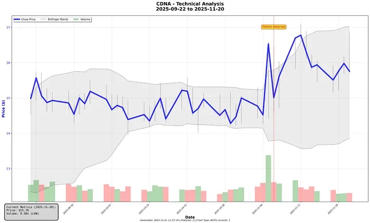
Real-World Volume Example: CareDx (CDNA)
CareDx demonstrates the ideal volume signature for a volatility compression breakout. The Bollinger Bands tighten progressively through the consolidation, and trading volume compresses steadily through late October. Volume begins increasing on November 4th, with a significant volume surge the following day as price breaks above the consolidation range — the textbook compression-to-breakout volume pattern.
Dimension 3: Breakout Readiness (31% of Total Pattern Score)
Structure tells our algorithm the pattern is well-formed. Volume confirms institutional accumulation is likely happening. But when will the breakout actually occur? The Breakout Readiness dimension measures whether the pattern is ready to trade now or needs more time to develop.
Breakout Proximity: How Close Is the Stock to Resistance?
How close is the current stock price to breaking through its resistance level? Our algorithm measures this in ATR (Average True Range) units to normalize across stocks with different volatility characteristics. The score ranges from zero (more than 2.0 ATR away from resistance) to four (less than 0.2 ATR away from resistance — imminent breakout territory).
Why measure in ATR instead of dollars or percentages? A volatile growth stock might be $5 from resistance but that's only 0.3 ATR — very close in the context of its normal daily moves. A stable utility stock $1 from resistance might be 2 ATR away — relatively far given its typical price action. ATR normalizes breakout proximity across different stock characteristics and volatility profiles.
Recent Price Momentum
What's the stock price doing in the last 5–10 trading days? Is it building momentum toward a breakout or stalling within the range? This variable ranges from zero points (price trend is negative or flat) to three points (price has increased by more than 5% recently). Positive recent momentum shows buying conviction is building as the stock approaches the breakout level.
Higher Lows Pattern Within the Compression Range
Are the daily price lows consistently rising within the consolidation range? This classic technical analysis signal shows selling supply exhausting and buying demand strengthening. The score ranges from zero points (less than 45% of days showing higher lows) to three points (more than 75% of days showing higher lows).
A stock making higher lows day after day, even within a tight trading range, shows that buyers are supporting the stock at progressively higher price levels. Sellers are getting weaker with each passing day — supply is drying up while demand builds from below.
Real-World Breakout Readiness Example: Brookdale Senior Living (BKD)
Brookdale Senior Living provides an excellent example of high breakout readiness in our scoring system. Price consolidates in a tight $8.50–$9.20 range for six weeks — a well-formed compression base. The declining ATR shows volatility steadily compressing from 3.5% to 2.5%. Bollinger Bands squeeze together as the range tightens. Price tests resistance at $9.20 multiple times without breaking through, building energy with each test.
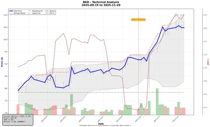
Then on November 3rd, volume increases, ATR starts expanding (volatility returning), and price breaks above resistance — the coiled spring releases. Within two weeks, the stock moves to $10.50, a 14% gain from the pattern detection point.
Where We're Improving Our Volatility Compression Detection Algorithm
Our pattern scoring system has been refined through analysis of over 1,100 pattern detections, but we recognize there's always room for improvement. Algorithmic pattern detection is as much art as science, and systematic trading approaches must constantly evolve as markets change and as we gather more performance data.
Improving Pattern Quality and Visual Consistency Scoring
While our stock scanner algorithm effectively measures mathematical characteristics like compression strength and range tightness, we've observed that some high-scoring patterns don't exhibit the visual "cleanliness" that experienced technical traders look for when reviewing charts. Two patterns might both score 85, but one shows smooth, consistent consolidation while another has irregular, choppy price action within the range.
We're exploring additional metrics that capture pattern consistency — measuring day-to-day smoothness of the consolidation, identifying disruptive price spikes within the compression period, and distinguishing between patterns that meet our thresholds at the margins versus those that exceed them convincingly.
Enhancing Volume Anomaly Detection
Our volume scoring currently measures aggregate volume characteristics: average decline, trend direction, and current status. However, we've noticed that some patterns show anomalous volume behavior — random volume spikes during what should be quiet accumulation periods — that our current metrics don't fully capture.
These volume irregularities can indicate distribution (institutional selling) rather than accumulation, or suggest the pattern has experienced false breakout attempts that ultimately failed. Incorporating volume consistency measurements and penalizing patterns with multiple unexplained volume surges during compression could meaningfully improve detection quality.
Adding Liquidity and Tradability Filters
Not all technically valid volatility compression patterns are equally tradable in practice. Stocks with very low average daily volume, wide bid-ask spreads, or thin order books present execution challenges that diminish the practical value of even well-formed patterns for real-world trading.
While we currently detect patterns across the full market spectrum, we're evaluating minimum liquidity thresholds that would filter out patterns that, while technically interesting, present practical trading difficulties. This includes considerations around minimum dollar volume, average share volume, and market capitalization that affect both institutional participation likelihood and retail execution quality.
Detecting False Breakouts and Pattern Fatigue
Some compression patterns test resistance multiple times during consolidation — each test representing a potential breakout that fails. These repeated failures can exhaust buying pressure and actually reduce the probability of eventual breakout success. Similarly, patterns that consolidate for extended periods beyond our optimal duration window can go "stale" as market conditions shift and participant interest wanes.
We're investigating ways to identify and penalize patterns showing signs of fatigue, including multiple failed breakout attempts, extended consolidation beyond typical profitable timeframes, or gradual deterioration in the underlying momentum that initially created the compression.
Building Systematic Outcome Tracking and Feedback Loops
The most powerful improvement mechanism for any algorithmic trading system is systematic outcome tracking with feedback loops. By measuring actual post-detection performance across different score bands, pattern types, and market conditions, we can identify which scoring components truly predict breakout success and which carry less predictive weight than our current weightings suggest.
This includes tracking entry quality (did we detect patterns at optimal entry points or too early/late?), analyzing which dimension scores correlate most strongly with positive trading outcomes, and understanding how pattern performance varies across different market environments like bull markets, corrections, or high-volatility periods. These insights allow us to continuously refine our weightings, adjust our thresholds, and evolve our methodology based on real-world results rather than theoretical expectations.
Pattern detection is an iterative process. Each batch of detections provides new performance data, each outcome teaches us something about what works and what doesn't, and each refinement makes the next generation of detections more reliable. We're committed to this continuous improvement process, always seeking the balance between mathematical rigor and practical trading utility.
We're committed to continuous improvement and share our methodology openly with subscribers. Start your free trial here. We would love to hear from our users and are striving to address each feedback item.
Risk Warning
Pattern-based trading involves substantial risk of loss. Past performance does not guarantee future results. The statistics and examples in this article describe historical system performance, not predictions of future outcomes. Market conditions change. Patterns fail. Individual results will vary significantly.
The scoring system described here evaluates pattern quality based on historical data. High-scoring patterns can and do fail. Low-scoring patterns occasionally work. Use pattern detection as one input among many in your investment research, not as a complete trading system.
Volatility compression patterns, like all technical analysis patterns, represent probabilities, not certainties. A pattern with a 65% win rate means 35% of the time it fails. Position sizing, risk management, and stop losses are critical components of any systematic trading approach.
Educational Content Disclaimer
This article explains technical analysis methodology and describes how our algorithmic pattern detection system works. Nothing here constitutes investment advice or recommendations to buy or sell securities. We are not registered investment advisors or financial planners.
The discussions about position sizing, stop losses, and risk management describe how these elements work in pattern trading based on technical analysis literature and common practices. These are educational descriptions, not guidance on what you personally should do. Consult a qualified financial professional who understands your complete financial situation before making investment decisions.