

In April I published that 78.3% of our highest-scoring inverse head and shoulders setups were trading higher two weeks after detection. The honest number is 64.5%. I wrote about that gap in August: the win rates I published came from the same period the scoring models were trained on, which is overfitting (a model finds patterns in its training data that do not hold up on new data, so it looks better than it is).
I went back to fix the models. The models turned out to be the smaller problem. The stop losses were wrong, and they were doing more damage than the overfitting was.
Correcting the stops and measuring on data no model had seen dropped nine of our sixteen patterns out of the daily recommendations and cut the win rate we display in the emails by nine points. The win rate we actually achieved barely moved: 60.8% against 60.9%.
How the stops were being placed
Every recommendation carries a stop loss and a price target. Ours were derived from daily bars: the pattern's structure gives you a support level, you place the stop below it, you size the target from the pattern height. That is the textbook method and it is what I built.
The trouble with daily bars is that they hide the day. A stock that closes up 1% may have traded down 3% at eleven in the morning. The daily bar shows you a winner; the intraday tape shows a position that was stopped out hours earlier and never got back in.
I rebuilt the stop and target calculation on intraday data, then searched for the best stop distance for each pattern type at each level of average true range (ATR, a standard measure of how far a stock typically travels in a day).
Finding 1: chart pattern trades were being stopped out 33% of the time
This is the number that surprised me the most.
| Pattern | Stop-out rate, old stops | New stops | Change |
|---|---|---|---|
| Inverse head and shoulders | 45.9% | 12.7% | -33.2 |
| Flat base | 41.4% | 17.0% | -24.4 |
| Post collapse recovery | 39.5% | 20.0% | -19.5 |
| Bullish engulfing | 39.2% | 19.5% | -19.7 |
| Volatility compression | 30.3% | 12.0% | -18.3 |
| Symmetrical triangle | 31.2% | 19.6% | -11.6 |
| Bull flag | 25.9% | 14.8% | -11.1 |
| Falling wedge | 26.9% | 19.5% | -7.4 |
| Cup and handle | 33.7% | 33.3% | -0.3 |
(Detections scoring 30 or above, weighted by count, January to July 2026.)
Nearly half of all inverse head and shoulders positions were being stopped out. The pattern's direction call was not that bad: its win rate over the same detections is 59%. The stop was sitting inside the stock's ordinary daily noise. Same story for flat base, and for post collapse recovery, and for bullish engulfing.
Across the whole service the stop-out rate fell from 33% to 18%. I had been throwing away about fifteen percent of all trades for no reason other than placing the stop too tightly.
Now look at the last row. Cup and handle did not move. If I had built a rule that simply loosened every stop, cup and handle would have improved with everything else and I would not trust any of this. It did not, because its stops already sat outside its intraday range. That is the control, and I did not design it. It fell out of the data.
Finding 2: correcting the stops changed which chart patterns qualify
Here is the part I should have predicted and did not.
Every candidate has to clear a profitability bar before it reaches your inbox: with the stop where it sits, the expected return has to be positive. Set the stops too tight and you lose winners to ordinary noise. Set them too loose and you sit in losers long past the point you should have been out, which drags the average down. The right stop sits between those two failures, and it is in a different place for every pattern.
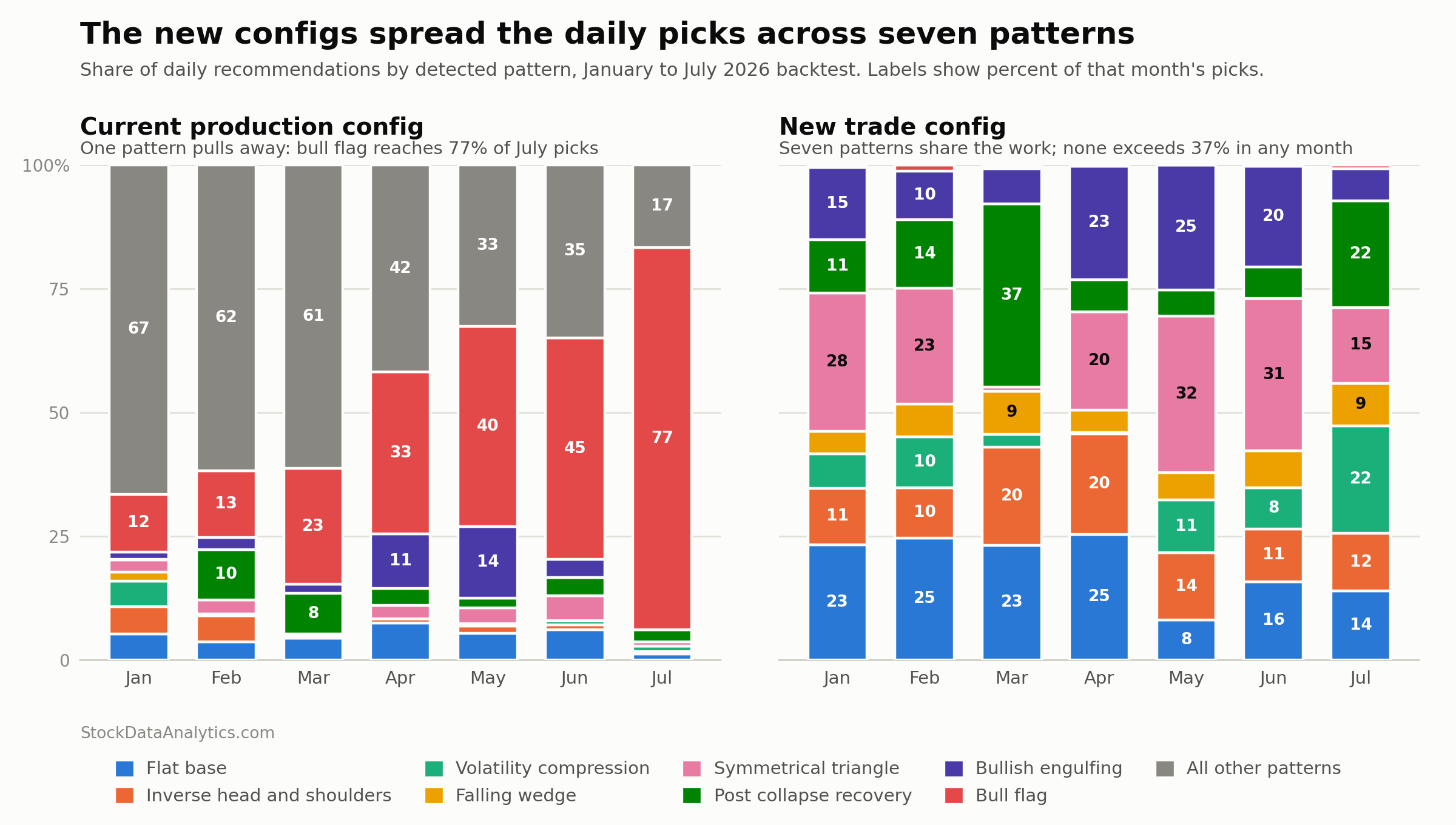
Once the stops were realistic, the ranking inverted. Bull flag supplied 36% of our recommendations across the first seven months of 2026, and 77% of everything that went out in July. Under the corrected stops it supplies half of one percent. Symmetrical triangle went from 2.4% of picks to 21%. Bullish engulfing, a single-candle pattern most technical analysis books treat as a minor signal, went from 4.9% to 15%.
| Pattern | Share of picks, old stops | New stops |
|---|---|---|
| Bull flag | 36.4% | 0.5% |
| Symmetrical triangle | 2.4% | 21.4% |
| Flat base | 4.8% | 19.1% |
| Bullish engulfing | 4.9% | 15.4% |
| Post collapse recovery | 4.3% | 14.4% |
| Inverse head and shoulders | 1.9% | 14.0% |
| Volatility compression | 1.1% | 8.7% |
| Falling wedge | 0.2% | 6.5% |
| Ascending triangle | 10.7% | 0% |
| Bullish pennant | 11.3% | 0% |
| Three white soldiers | 7.9% | 0% |
Seven of the sixteen patterns stopped producing recommendations entirely. Two more, bull flag among them, fell to a handful of picks across seven months. They are all still detected and still tracked. They just no longer clear the bar, and I would rather send you nothing from a pattern than send you something that does not pay.
The system also got steadier, which matters more than it sounds. Under the old stops the share held by the single largest pattern swung between 22% and 77% across seven months. That is another way of saying the product quietly turned into a bull flag service without anyone deciding it should. Under the new stops it stays between 22% and 37%, and the lead rotates: symmetrical triangle in January, flat base in February and April, post collapse recovery in March, volatility compression in July.
Finding 3: the win rate we advertise fell nine points and the one we achieve did not move
This is the trade, stated plainly.
| Old stops | New stops | |
|---|---|---|
| Projected win rate shown to subscribers (median) | 65% | 56% |
| Win rate actually achieved | 60.9% | 60.8% |
| Stop-out rate | 32.7% | 17.5% |
| Market beat rate | 48.0% | 47.0% |
| Average return per trade | 0.16% | 0.65% |
Read the first two rows together. The projected win rate shown in the emails fell nine points. The result behind it moved by five hundredths of one point. The old number was not measuring anything about the trades. It was measuring how optimistic the stop placement had made the model.
There is a second number in that table I find more uncomfortable, and I would rather say it here than have a subscriber work it out. Under the old configuration we showed 65% and delivered 60.9%. Under the new one we show 56% and deliver 60.8%. We have gone from overstating by four points to understating by five. Both are wrong. The projection needs recentering and that work is next.
The last row is the one that matters most to a subscriber. Average return per trade went from 0.16% to 0.65%, and it went there for two reasons: the stops stopped cutting winners short, and the patterns that could not clear the profitability bar stopped appearing at all.
One caveat belongs right here rather than at the bottom of the article. The stop settings were tuned on this same seven-month window, so 0.65% is the best case for that period and not a forward estimate. The stop-out reduction is a fact about where the stops sit. The return figure is a result measured on the data the stops were fitted to.
What this means for you
If you take signals from any source, including this one, ask where the stop is and how it was set. A win rate measured with a stop sitting inside the day's ordinary noise is measuring the stop, not the pattern. That is the general lesson, and it cost me a year of published numbers to learn it.
For subscribers, three things change.
- Stops now sit further from the entry. They are wider because the old ones were being triggered by ordinary intraday movement rather than by the trade actually going wrong. If you have been stopped out of trades that recovered without you (a false stop), that rate has roughly halved.
- The pattern mix is different. Seven patterns now clear the profitability bar instead of sixteen. That is a consequence of measuring honestly, not a change in what we detect. The other nine are still scanned and still tracked.
- The projected win rate is now conservative. We used to show about four points more than we delivered. We now show about five points less. If you were applying your own discount to our number, you can drop it.
Limitations
Seven months is one regime. January to July 2026 covers a specific market and says nothing about how these stops behave in another one.
The scoring models were trained through 2025, so this window is genuinely out of sample for them. The stop settings are a different matter: I fitted them on this same January to July 2026 window. That makes the stop-out and return figures in-sample for the stops, which means I have done a smaller version of the thing this article is about. The next quarterly audit measures these stops on a window they have never seen, and I will publish that number whether it holds up or not.
The market beat rate (how often the position outperformed the index over the same two weeks) is identical under both stop configurations at every score band, because it is computed on the underlying two-week move without reference to where the stop sat. It cannot show the improvement and I am not claiming it does. It sits near 47% either way, and it remains the least flattering number we publish.
The service also lost some coverage. On our largest plan the NASDAQ list now fills to twenty picks on 83% of days rather than 94%. Fewer patterns qualifying means fewer candidates on thin days, and February and March produced most of the shortfalls.
Frequently asked questions
How often do chart pattern trades get stopped out?
Across 6,000+ NASDAQ and NYSE stocks between January and July 2026, 33% of our chart pattern trades were stopped out when stops were placed from daily bars. Recalibrating the stops on intraday data cut that to 18%. The difference was mostly trades the pattern had called correctly.
Why do I keep getting stopped out of trades that recover without me?
The usual cause is a stop placed inside the stock's ordinary intraday range. A daily bar hides what happened during the session, so a stock that closes up 1% may have traded down 3% at eleven in the morning and taken your stop with it. About 15% of all our trades were being lost this way before we recalibrated on intraday data.
Where should the stop loss go on a chart pattern trade?
Below the pattern's support level, at a distance scaled to how far that specific stock typically moves in a day. We set ours by average true range (ATR) per pattern type rather than by a fixed percentage, because the same 2.5% stop is generous on a quiet stock and sits inside the noise on a volatile one.
Which chart patterns does StockDataAnalytics recommend?
Seven, as of September 2026: symmetrical triangle, flat base, bullish engulfing, post collapse recovery, inverse head and shoulders, volatility compression, and falling wedge. We detect sixteen patterns in total. The other nine currently do not clear our profitability bar, which requires a positive expected return after a realistic stop.
Do chart patterns actually work?
They produce a measurable edge, and it is smaller than most sources claim. Across 6,000+ stocks from January to July 2026, our top-scored setups won 60.8% of the time and beat the market 47% of the time. The second number is the one most pattern sites do not publish.
What comes next
Daily recommendations now come from seven patterns: symmetrical triangle, flat base, bullish engulfing, post collapse recovery, inverse head and shoulders, volatility compression, and falling wedge. That is fewer names than before and I am not going to dress it up: a system that finds seven tradeable setups is narrower than one claiming sixteen.
As I mentioned last time, I am rebuilding the scoring models so that a higher score reliably means a better trade. Right now that relationship holds through the middle of the range and breaks down at the top. The nine patterns that dropped out of the recommendations are first in line for that rebuild.
Every quarter I rerun this audit on the newest window no model has seen, and publish what it says. As more history accumulates, the stop settings get retested along with everything else.
Have you ever checked your own stop-out rate against the win rate your signal source advertises? If you have, I would like to hear what the gap looked like. Reply to any of our emails or write to me directly.
Disclaimer: StockDataAnalytics.com is a financial data and analytics service. The information provided through our platform, including stock pattern detection, entry zones, stop losses, and price targets, is for informational and educational purposes only and does not constitute financial advice, investment advice, trading advice, or any other type of advice. We are not registered investment advisors, broker-dealers, or financial planners. Past performance of any pattern or recommendation does not guarantee future results. All investments involve risk, including the possible loss of principal. You should consult with a qualified financial advisor before making any investment decisions. By using our service, you acknowledge that all trading decisions are made at your own risk.